How to create a progress-bar with Tailwind CSS and Alpinejs

how-to-create-a-progress-bar-with-tailwind-css-and-alpinejs

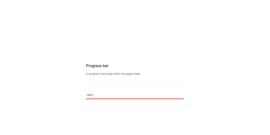
A progress bar, that’s what we are going to build.

See it live and get the code

Why are progress bars important

When you are building a website, you will probably have to show a progress bar to your users for many different reasons.
For example, you might want to show a progress bar to your users when they are uploading a file, or when they are downloading something.
Some Use cases:

  • Show a progress bar to your users when they are uploading a file.
  • Show a progress bar to your users when they are downloading something.
  • Show a progress bar to your users when they are processing a form.
  • When reading a blog post, show a progress bar to show long is left to read.

Let’s create the structure

The important parts:

  • x-data="{ progress: 0, interval: null }" is the data that will be used to store the progress value.
  • x-init="() => { interval = setInterval(() => { progress < 100 ? progress += 5 : clearInterval(interval); }, 100); }" is the code that will be executed every 100ms to update the progress value.
  • x-text="progress + '%'" is the code that will be executed to display the progress value.
  • x-bind:style="'width: ' + progress + '%;'" is the code that will be executed to set the width of the progress bar.

  x-data="{ progress: 0, interval: null }"
  x-init="() => { interval = setInterval(() => { progress < 100 ? progress += 5 : clearInterval(interval); }, 100); }">
  
    x-text="progress + '%'">
  
x-bind:style="'width: ' + progress + '%;'" >

Let's add some the classes with Tailwind CSS

The important parts:

  • w-full is the width of the container.
  • text-sm text-gray-500 is the text color.
  • bg-gray-200 is the background color.
  • rounded-full is the border radius.
  • h-2 is the height of the progress bar.
  • transition-all is the transition effect.
  • ease-in-out is the animation effect.
  • duration-500 is the duration of the animation.
  • cursor-pointer is the cursor style.
  • relative is the positioning style.
  • overflow-hidden is the overflow style.

  x-data="{ progress: 0, interval: null }"
  x-init="() => { interval = setInterval(() => { progress < 100 ? progress += 5 : clearInterval(interval); }, 100); }"
  class="w-full">
  
    class="text-sm text-gray-500"
    x-text="progress + '%'">
  
class="relative h-2 mt-2 bg-gray-200 rounded-full"> x-bind:style="'width: ' + progress + '%;'" class="absolute top-0 left-0 h-full bg-orange-500 rounded-full">

Well that was it! You can now use the progress bar in your project.

Conclusion

In this tutorial, we learned how to create a progress bar using Tailwind CSS and Alpine.js. We covered the basics of Tailwind CSS, including its syntax and classes, and how to use them in our progress bar.

Total
0
Shares
Leave a Reply

Your email address will not be published. Required fields are marked *

Previous Post
how-to-create-a-product-brief:-strategies,-best-practices,-and-examples

How to Create a Product Brief: Strategies, Best Practices, and Examples

Next Post
25-product-marketing-kpis-&-metrics-to-track-success

25 Product Marketing KPIs & Metrics to Track Success

Related Posts