Welcome to Code With Random blog. In this blog, we learn how we create a Hamburger Menu using HTML, Css, and javascript for the Responsive Hamburger Menu Project.
I hope you enjoy our blog so let’s start with a basic HTML structure for the Hamburger Menu.
HTML Code For Hamburger Menu
Navbar
There is all the HTML code for the Hamburger Menu. Now, you can see an output with Hamburger Menu then we write javascript for Hamburger Menu.
output

CSS Code For Hamburger Menu
/*
===============
Fonts
===============
*/
@import url("https://fonts.googleapis.com/css?family=Open+Sans|Roboto:400,700&display=swap");
/*
===============
Variables
===============
*/
:root {
/* dark shades of primary color*/
--clr-primary-1: hsl(205, 86%, 17%);
--clr-primary-2: hsl(205, 77%, 27%);
--clr-primary-3: hsl(205, 72%, 37%);
--clr-primary-4: hsl(205, 63%, 48%);
/* primary/main color */
--clr-primary-5: hsl(205, 78%, 60%);
/* lighter shades of primary color */
--clr-primary-6: hsl(205, 89%, 70%);
--clr-primary-7: hsl(205, 90%, 76%);
--clr-primary-8: hsl(205, 86%, 81%);
--clr-primary-9: hsl(205, 90%, 88%);
--clr-primary-10: hsl(205, 100%, 96%);
/* darkest grey - used for headings */
--clr-grey-1: hsl(209, 61%, 16%);
--clr-grey-2: hsl(211, 39%, 23%);
--clr-grey-3: hsl(209, 34%, 30%);
--clr-grey-4: hsl(209, 28%, 39%);
/* grey used for paragraphs */
--clr-grey-5: hsl(210, 22%, 49%);
--clr-grey-6: hsl(209, 23%, 60%);
--clr-grey-7: hsl(211, 27%, 70%);
--clr-grey-8: hsl(210, 31%, 80%);
--clr-grey-9: hsl(212, 33%, 89%);
--clr-grey-10: hsl(210, 36%, 96%);
--clr-white: #fff;
--clr-red-dark: hsl(360, 67%, 44%);
--clr-red-light: hsl(360, 71%, 66%);
--clr-green-dark: hsl(125, 67%, 44%);
--clr-green-light: hsl(125, 71%, 66%);
--clr-black: #222;
--ff-primary: "Roboto", sans-serif;
--ff-secondary: "Open Sans", sans-serif;
--transition: all 0.3s linear;
--spacing: 0.1rem;
--radius: 0.25rem;
--light-shadow: 0 5px 15px rgba(0, 0, 0, 0.1);
--dark-shadow: 0 5px 15px rgba(0, 0, 0, 0.2);
--max-width: 1170px;
--fixed-width: 620px;
}
/*
===============
Global Styles
===============
*/
*,
::after,
::before {
margin: 0;
padding: 0;
box-sizing: border-box;
}
body {
font-family: var(--ff-secondary);
background: var(--clr-grey-10);
color: var(--clr-grey-1);
line-height: 1.5;
font-size: 0.875rem;
}
ul {
list-style-type: none;
}
a {
text-decoration: none;
}
h1,
h2,
h3,
h4 {
letter-spacing: var(--spacing);
text-transform: capitalize;
line-height: 1.25;
margin-bottom: 0.75rem;
font-family: var(--ff-primary);
}
h1 {
font-size: 3rem;
}
h2 {
font-size: 2rem;
}
h3 {
font-size: 1.25rem;
}
h4 {
font-size: 0.875rem;
}
p {
margin-bottom: 1.25rem;
color: var(--clr-grey-5);
}
@media screen and (min-width: 800px) {
h1 {
font-size: 4rem;
}
h2 {
font-size: 2.5rem;
}
h3 {
font-size: 1.75rem;
}
h4 {
font-size: 1rem;
}
body {
font-size: 1rem;
}
h1,
h2,
h3,
h4 {
line-height: 1;
}
}
/* global classes */
/* section */
.section {
padding: 5rem 0;
}
.section-center {
width: 90vw;
margin: 0 auto;
max-width: 1170px;
}
@media screen and (min-width: 992px) {
.section-center {
width: 95vw;
}
}
main {
min-height: 100vh;
display: grid;
place-items: center;
}
/*
===============
Navbar
===============
*/
nav {
background: var(--clr-white);
box-shadow: var(--light-shadow);
}
.nav-header {
display: flex;
align-items: center;
justify-content: space-between;
padding: 1rem;
}
.nav-toggle {
font-size: 1.5rem;
color: var(--clr-primary-5);
background: transparent;
border-color: transparent;
transition: var(--transition);
cursor: pointer;
}
.nav-toggle:hover {
color: var(--clr-primary-1);
transform: rotate(90deg);
}
.logo {
height: 70px;
width: 70px;
border-radius: 63px;
}
.links a {
color: var(--clr-grey-3);
font-size: 1rem;
text-transform: capitalize;
letter-spacing: var(--spacing);
display: block;
padding: 0.5rem 1rem;
transition: var(--transition);
}
.links a:hover {
background: var(--clr-primary-8);
color: var(--clr-primary-5);
padding-left: 1.5rem;
}
.links {
height: 0;
overflow: hidden;
transition: var(--transition);
}
.show-links {
height: 10rem;
}
@media screen and (min-width: 800px) {
.nav-center {
max-width: 1170px;
margin: 0 auto;
display: flex;
align-items: center;
justify-content: space-between;
padding: 1rem;
}
.nav-header {
padding: 0;
}
.nav-toggle {
display: none;
}
.links {
height: auto;
display: flex;
}
.links a {
padding: 0;
margin: 0 0.5rem;
}
.links a:hover {
padding: 0;
background: transparent;
}
}
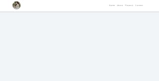
Css Updated output
javascript Code For Hamburger Menu
// classList - shows/gets all classes
// contains - checks classList for specific class
// add - add class
// remove - remove class
// toggle - toggles class
const navToggle = document.querySelector(".nav-toggle");
const links = document.querySelector(".links");
navToggle.addEventListener("click", function () {
links.classList.toggle("show-links");
});
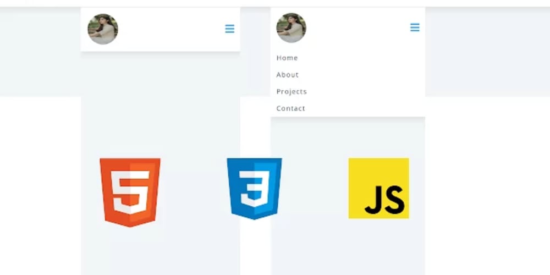
Final output Of Hamburger Menu


Now that we have completed our javascript section, Here is our updated output with Html,Css And javascript. Hope you like the Hamburger Menu. you can see the output video and project screenshots. See our other blogs and gain knowledge in front-end development. Thank you!
This post teaches us how to create a Hamburger Menu using simple HTML & CSS and javascript. If we made a mistake or any confusion, please drop a comment to reply or help you in easy learning.
Written by – Code With Random/Anki
Check out more…..
Some related topics –
make-calendar-using-html-css-javascript-
music-player-project-in-html-and-css
simple-css-waves-wave-background-css-pure-css-wave
add-to-cart-button-animation-add-to-cart-button-html-css-javascript


