Hello Everyone today I will show you how to create a 3d card effect with HTML and CSS. I followed Kevin Powell’s Youtube tutorial and did some minor changes, I recommend watching the tutorial for a better understanding, Link is attached below.
Credit – Kevin Powell
Youtube – https://youtu.be/Z-3tPXf9a7M
Let’s get started…
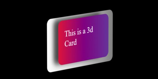
Working Demo –
HTML –
 class="effect">
  This is a 3d Card


