Angular: Design Pop Over

angular:-design-pop-over

In almost every SPA, popover is very much used component in Angular.

Here, I am going to design simple pop over. Someone, who are going to make use of this can improve further based on your requirements.

Here is the code:


 (mouseover)="showPopOver = true" (mouseleave)="showPopOver = false">
  Show Pop Over!

*ngIf="showPopOver" class="pop-over">

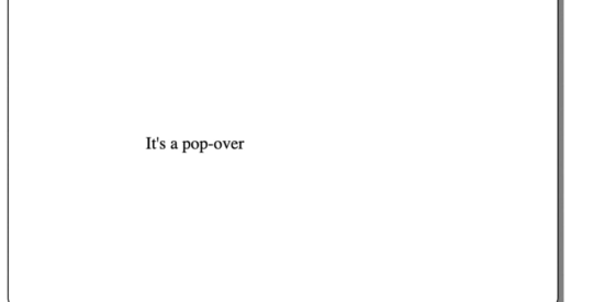
It's a pop-over
//component.ts
import { Component, VERSION } from '@angular/core';

@Component({
  selector: 'my-app',
  templateUrl: './app.component.html',
  styleUrls: ['./app.component.scss'],
})
export class AppComponent {
  showPopOver = false;
}
//component.scss
p {
  cursor: pointer;
}

.pop-over {
  position: absolute;
  align-items: center;
  justify-content: center;
  border: 1px solid black;
  border-radius: 10px;
  width: 16rem;
  padding: 8rem;
  z-index: 1;
  box-shadow: 5px 10px grey;
}

.pop-over::before {
  border-width: 10px;
  border-style: solid;
  border-color: transparent transparent grey transparent;
  top: -20px;
  left: 4px;
  content: '';
  position: absolute;
}

Here you can see the same in live:

Hover over Show Pop over! and observe pop over being shown.

You can follow me here: https://twitter.com/urstrulyvishwak

Thanks.

Total
8
Shares
Leave a Reply

Your email address will not be published. Required fields are marked *

Previous Post
what-is-the-software-development-life-cycle?

What is the software development life cycle?

Next Post
progressive-reactivity-with-ngrx/store-and-ngxs

Progressive Reactivity with NgRx/Store and NGXS

Related Posts