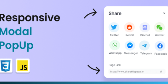
👋 Hello, Dear developers 👩💻
Today we will be lookup on how to build a responsive modal using CSS, so stay tunned🔥
Introduction
Modal Popups are used very often in modern websites or Apps, to display notifications or alerts, handle user’s sign up or login forms, newsletters & much more ✨
I created this tutorial, on how to create a responsive modal popup box with a clean design, with the help of HTML as markup, CSS for styling and vanilla javascript for adding functionality 🧠🚀
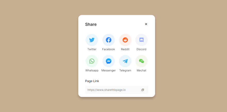
Here’s how it will look once we are finished in the below GIF⬇️
But Before that, You can view the code tutorial of the finished product before continuing this blog ⬇️
So here, we have a few components added to our markup.
First, we have a simple open modal button which is named a share button, when clicked on, it triggers the function of opening the modal, then we have the close modal button which performs the opposite operation/function to the open button to close modal, then we have few social sharing option’s and at last, we have the input box with just fake placeholder value in it.
Let’s add the styles stepwise to understand what we’re doing,
First of all, we will look at making some basic changes in our CSS file which includes resets of the root, HTML & variables.
@importurl("https://fonts.googleapis.com/css2?family=Inter:wght@200;300;400;600&display=swap");*,*::before,*::after{box-sizing:border-box;}*{margin:0;padding:0;box-sizing:border-box;font-family:"Inter",sans-serif;}:root{/*========== Colors ==========*/--first-color:#373d46;--modal-bg-color:#fff;--text-input-bg:#f8f9fa;--text-color:#95989d;--container-bg:#c7ad91;--btn-color:#ddc0a1;/* ===== SOCIAL ICONS BACKGROUND COLOR ===== */--twitter:#e8f6fe;--whatsapp:#e9fbf0;--facebook:#e8f1fe;--reddit:#ffece6;--discord:#f1f3fb;--messenger:#e6f3ff;--telegram:#e6f3fa;--wechat:#f2f7ea;/*========== Font and typography ==========*/--normal-font-size:0.88rem;--large-font-size:1.25rem;--share-link-span:0.9869em;--share-input-font-size:0.8em;/*========== z index ==========*/--z-modal:1000;}@mediascreenand(min-width:991px){:root{--large-font-size:1.5rem;--normal-font-size:1rem;--share-link-span:1.1em;--share-input-font-size:1em;}}/*=============== BASE ===============*/body{font-weight:500;background-color:var(--btn-color);}button{background-color:transparent;outline:none;border:none;cursor:pointer;font-family:inherit;}img{max-width:100%;height:auto;}ulli{margin:0;padding:0;list-style-type:none;}.container{height:100vh;display:grid;place-items:center;background-color:var(--container-bg);}
Okay Nice ! we are moving further 🏃♀️🏃♂️
So after adding those base styles, we look up our markup and use the classes that we have given to each component (tag) in order to add them styles individually.
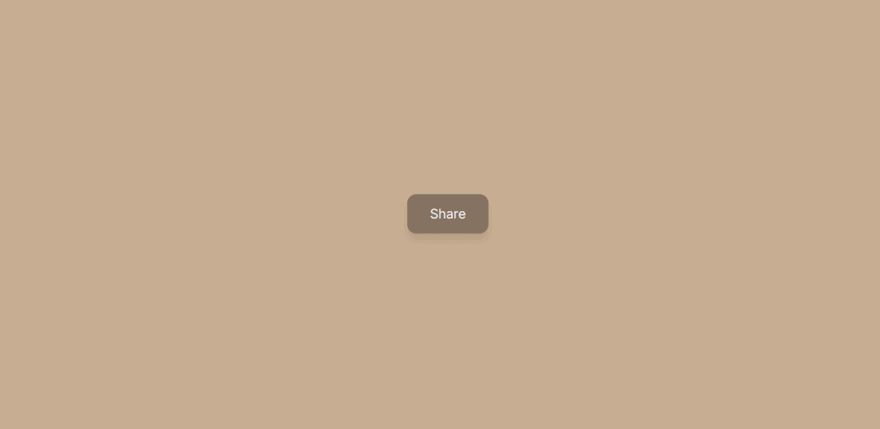
The styles for the share modal button are background color, font size along with visual goodies like padding, border-radius & pseudo hover class on background color.
Result ⬇️
2. Share modal
The share modal is the most important, where all of the content is situated
we added an absolute position on it at the bottom with a 0% percentage value along the visual goodies like box shadow, border radius, opacity, and extra white space by using padding and transition property as well.
These options are structured with the help of CSS Grid, for the background color of social sharing options, we used the data-icon attribute property on each tag in html file & added light color as a background to add contrast against the actual logo.
Before moving to the final, here is the class that handles the styles when the modal is opened.
.show-modal{opacity:1;visibility:visible;}
6. Media queries to make it responsive 📱
Finally, we want to make it responsive or at least look good on both mobile and desktop, so below are the few breakpoints on the share modal button, modal, modal content, and list.
😤 Finally, To make our modal popup box intractive or actually work, we will be using few lines of javascript logic 🧠
Javascript code ⬇️
/*=============== SHOW MODAL ===============*/constopenBtn=document.querySelector(".share__modal_btn");constmodalContainer=document.querySelector(".share__modal");if(openBtn&&modalContainer){openBtn.addEventListener("click",()=>{modalContainer.classList.add("show-modal");});}/*=============== CLOSE MODAL ===============*/constcloseBtn=document.querySelector(".close_modal_btn");functioncloseModal(){constmodalContainer=document.querySelector(".share__modal");modalContainer.classList.remove("show-modal");}closeBtn.addEventListener("click",closeModal);/*====== ESC BUTTON TO CLOSE MODAL ======*/document.addEventListener("keydown",(event)=>{if(event.key==="Escape"){closeModal();}});
So here we have three event listeners who are adding or removing the show-modal class from the modalContainer :
When OpenBtn is clicked, we want to add a show-modal class to modalContainer in order to show the modal to users.
When closeBtn is clicked, we perform the opposite operation to open the button that is to remove the show-modal class & hide the modal.
Escape key-down event listener on dom to hide the modal by simply calling the closeModal() function.
So, the end result will finally look like this ⬇️
and that’s what we wanted 🥳🤘
I hope you find this post to be helpful and thanks for reading it 😇
Conclusion
As always, I hope you found it interesting. If you noticed any
errors in this article, please mention them in the comments. 🧑🏻💻
We use cookies on our website to give you the most relevant experience by remembering your preferences and repeat visits. By clicking “Accept All”, you consent to the use of ALL the cookies. However, you may visit "Cookie Settings" to provide a controlled consent.
This website uses cookies to improve your experience while you navigate through the website. Out of these, the cookies that are categorized as necessary are stored on your browser as they are essential for the working of basic functionalities of the website. We also use third-party cookies that help us analyze and understand how you use this website. These cookies will be stored in your browser only with your consent. You also have the option to opt-out of these cookies. But opting out of some of these cookies may affect your browsing experience.
Necessary cookies are absolutely essential for the website to function properly. These cookies ensure basic functionalities and security features of the website, anonymously.
Cookie
Duration
Description
cookielawinfo-checkbox-analytics
11 months
This cookie is set by GDPR Cookie Consent plugin. The cookie is used to store the user consent for the cookies in the category "Analytics".
cookielawinfo-checkbox-functional
11 months
The cookie is set by GDPR cookie consent to record the user consent for the cookies in the category "Functional".
cookielawinfo-checkbox-necessary
11 months
This cookie is set by GDPR Cookie Consent plugin. The cookies is used to store the user consent for the cookies in the category "Necessary".
cookielawinfo-checkbox-others
11 months
This cookie is set by GDPR Cookie Consent plugin. The cookie is used to store the user consent for the cookies in the category "Other.
cookielawinfo-checkbox-performance
11 months
This cookie is set by GDPR Cookie Consent plugin. The cookie is used to store the user consent for the cookies in the category "Performance".
viewed_cookie_policy
11 months
The cookie is set by the GDPR Cookie Consent plugin and is used to store whether or not user has consented to the use of cookies. It does not store any personal data.
Functional cookies help to perform certain functionalities like sharing the content of the website on social media platforms, collect feedbacks, and other third-party features.
Performance cookies are used to understand and analyze the key performance indexes of the website which helps in delivering a better user experience for the visitors.
Analytical cookies are used to understand how visitors interact with the website. These cookies help provide information on metrics the number of visitors, bounce rate, traffic source, etc.
Advertisement cookies are used to provide visitors with relevant ads and marketing campaigns. These cookies track visitors across websites and collect information to provide customized ads.


