
Quick note – This tutorial was made with the following dependency versions: "@sveltejs/kit": "next" & "tailwindcss": "^3.1.8". If something doesn’t work as it should, consider upgrading. Alternatively, if your versions are ahead, check which breaking changes have been introduced since.
Preconfiguration
We’ll be using SvelteKit for this tutorial. If you don’t have a project set up yet, you can get started here (I recommend Skeleton + TypeScript).
If you haven’t configured Tailwind and added it to an app.css file, there are easy-to-follow instructions on the docs.
Styling and using the Switch
Now that everything’s set up. We can start by creating the switch…
src/lib/ThemeSwitch/ThemeSwitch.svelte
type="checkbox" id="theme-toggle" />
for="theme-toggle" />
…and using it:
src/routes/+page.svelte (or wherever else you may want to consume it, eg. +layout.svelte)
/>
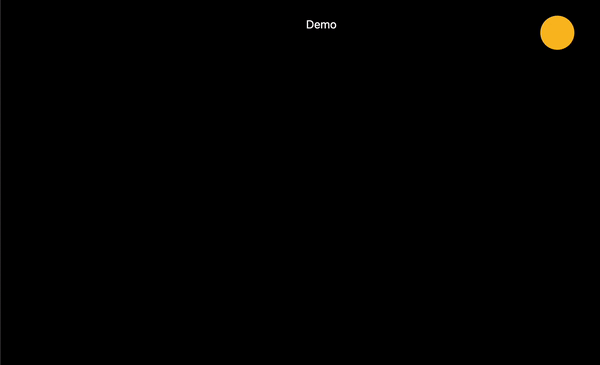
Demo
(Note: If you get an error about referencing $lib like I did and are using Visual Studio Code, try restarting your editor.)
At this point, you should have this:

Overriding Tailwind’s dark mode
To make dark mode integration as easy as possible, Tailwind includes a dark variant that lets you style your site differently when dark mode is enabled, eg: class="bg-white dark:bg-slate-800".
That’s cool, but we want to override the system default and toggle the dark mode manually. This means we’ll need to make the following change:
tailwind.config.cjs
module.exports = {
  darkMode: 'class',
  // ...
}
Now, dark:{class} classes will be applied whenever the dark class is present earlier in the HTML tree, rather than being based on prefers-color-scheme.
You can verify this works by adding class="dark" to the opening html tag in src/app.html, then adding the following:
src/app.css (You can also use a global style tag)
body {
  @apply bg-white dark:bg-black text-black dark:text-white text-center;
}
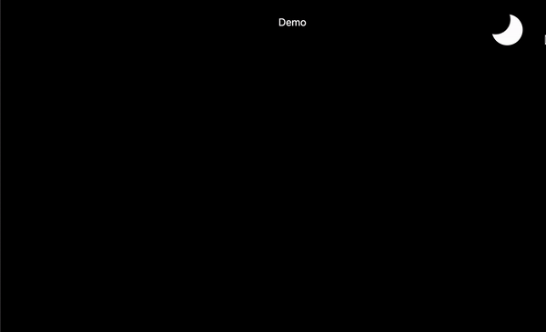
This should give us this (Still a non-functional switch, but the dark mode is enabled):
⚠️ Remember to remove the class="dark" from the opening html tag ⚠️
Adding functionality to the Switch
Time to add some functionality to that currently-useless switch. We want to replicate what we did by adding/removing the dark class from the root of the document.
We’ll need to take control of the checked value of the input and action something on:click:
checked={darkMode} on:click={handleSwitchDarkMode} type="checkbox" id="theme-toggle" />
for="theme-toggle" />
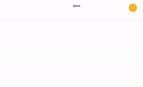
Which gives:
⚠️ Note – If your device is not set to dark mode like mine, your default behaviour will be different to mine – this will be dealt with soon ⚠️
Setting the default values
Utilising the Window.mediaMatch() API, we are able to update the darkMode value on load, dependant on what prefers-color-scheme the device is set to:
You may have noticed the if (browser)..., that’s just because we want to make sure that the code is only ran on the client (not server), otherwise the application would error with 500 - window is not defined.
So to recap so far:
- We have added a switch which adds and removes
darkas a class from root of the document. - Given that we’ve updated the
tailwind.config.cjsto go by class, styles are being picked up in thebodyblock withinapp.cssand being applied to thebackground-colorand textcolor. - We are detecting if the user has requested dark or light mode by default with prefers-color-scheme (which is a CSS media feature), and we are updating the
darkModestate (which is required by the switch) and modifying theclassListaccordingly.
There’s one more thing we need to do…
Enabling persistence with Local Storage
When we toggle the switch, we want to set the value in local storage:
localStorage.setItem('theme', darkMode ? 'dark' : 'light');
That will then allow us to check if the theme key exists, and if it does and matches the string dark, we know it’s a positive match and can add the class and update the variable. If not, we do the opposite:
<script lang="ts">
    import { browser } from '$app/environment';

    let darkMode = true;

    function handleSwitchDarkMode() {
        darkMode = !darkMode;

        localStorage.setItem('theme', darkMode ? 'dark' : 'light');

        darkMode
            ? document.documentElement.classList.add('dark')
            : document.documentElement.classList.remove('dark');
    }

    if (browser) {
        if (
            localStorage.theme === 'dark' ||
            (!('theme' in localStorage) && window.matchMedia('(prefers-color-scheme: dark)').matches)
        ) {
            document.documentElement.classList.add('dark');
            darkMode = true;
        } else {
            document.documentElement.classList.remove('dark');
            darkMode = false;
        }
    }
</script>
Let’s add a finishing touch to the body so that we can get a less abrupt transition between the 2 themes:
app.css
body {
    transition: background-color 0.2s ease-in-out, color 0.2s ease-in-out;
    @apply bg-white dark:bg-black text-black dark:text-white text-center;
}
Now let’s see it in action:
You can also do the initialisation in a
That’s it! The theme ('dark' | 'light') is now persisting on refresh! 🪄
Source code can be found here.
If you need any further information on the above or anything else (eg. adding new environments such as staging) check out the Vite docs, the SvelteKit docs or the official Svelte discord.


