During the spring and summer, I’ve been testing different AI tools for their ability to generate accessible Android user interfaces. This post is the final testing post in the series. I will then write a recap post to summarize all my findings.
The drill is the same for this test as well – I generated an Android app with Claude and then tested it with various accessibility tools, settings, and assistive technologies. Let’s first talk about the app I generated.
The App
This time, too, I did only one round of tests. The reason is similar to that of the previous tests with Cursor – the setup. I didn’t want to pay $20 for this one blog post, so I’m using the free version, which means I’ll need to operate within Claude’s app and use the chat feature. Not optimal, but it gets the job done within the limits of my tests.
So, in short, I generated the code in the chat, then created an Android project in Android Studio, added the necessary files, and copy-pasted the code into them.
Prompt
The prompt I gave to Claude was:
Can you generate UI screens for an Android app with Jetpack Compose, in which user can keep track of their yarn stash and knitting needles per size and type? It should contain the following screens: Home screen, where user can add both yarn and needles, a list screen for yarn, a details screen for individual yarn, a list screen for knitting needles, a details screen for knitting needles.
The information to store about yarn consists of following: Brand name, yarn name, colorway, yarage in meters, weight of skein, amount of skeins, picture. Information for knitting needles consists of the following: Brand name, knitting needles size in mm, type (single pointed, double pointed, circular). The type should be a dropdown.
The app screens should be accessible for users with alternative navigation (switch device, keyboard, voice navigation), as well as screen readers, and it should work well in both vertical and landscape orientations, as well as with larger font sizes.
It should follow all Material3 best practices.
It listed the accessibility aspects considered. Here’s that list:
- Semantic descriptions for all interactive elements
- Proper role assignments (Button, Switch, etc.)
- Content descriptions for screen readers
- Focus management with keyboard navigation support
- Support for large text scaling
- High contrast mode option
- Voice announcement controls
- Logical tab order in forms
- Accessible dropdown menus
- Proper heading hierarchy
- Alternative text for images/icons
- Screen orientation support
- Touch target size compliance (48dp minimum)
- Color contrast compliance with Material 3
- Support for switch navigation devices
A funny thing is that even though Claude generated a AccessibilityExtensions.kt-file, it’s not used anywhere. And oh my, how many redundancies does it contain. I could write a separate blog post about it.
So, while this list has many good points, in the context of this app, it’s mostly just a list without the actual implementation of the relevant points.
The UI
Here’s a short video of how the app turned out:
I must say I like it more than the other generated apps, which looked like copies of each other.
Testing Process
After building the app, I ran a limited set of manual accessibility tests on the app. I used my Pixel Fold, as I have everything for testing set up on it. The tools, assistive technologies, and accessibility settings I tested the app with were:
- Accessibility Scanner
- TalkBack
- Switch Access
- Physical keyboard
- Voice Access
- Large font sizes
The Problems I Found
As I expected, the app wasn’t without any accessibility problems. Most notably, the familiar problem with redundant content descriptions was present, and it also hallucinated some semantic roles.
Let’s look at the problems more closely.
Redundant Content Descriptions Are Here to Stay, Unfortunately
As with all the other apps, Claude’s app also had redundant content descriptions. Here’s one example (I’ve omitted the irrelevant parts)
FloatingActionButton(
    ...
    modifier = Modifier
        ...
        .semantics {
            contentDescription = "Add new yarn to collection"
        }
) {
    Row(...) {
          ...
        Text("Add New Yarn")
    }
}
In this case, the “to collection” part doesn’t add any relevant information. When the FloatingActionButton has the contentDescription attribute and the text within, the accessibility text for this component is “Add new yarn to collection. Add new yarn.” The solution would be to omit the semantics modifier with contentDescription.
Claude’s code takes the redundancy even further: for some contentDescriptions, it adds redundant action text as well. Here’s one example, a card for displaying needle list items with texts within the Card:
Card(
    modifier = Modifier
        .semantics {
            role = Role.Button
            contentDescription =
                "${needle.brandName} ${needle.type.displayName} " +
                "needles, ${needle.sizeMillimeters} millimeters. " +
                "Tap for details."
        },
    ...
) { ... }
The content description now contains all the same information as the contents of this card. It’s already exposed to accessibility services, so it’s redundant to add it here. However, it also adds the “Tap for details” text, which is redundant.
The card, being a clickable element, already contains the semantics to convey that it is clickable, so there’s no need to indicate it in the content description. In addition, as it’s an item on a list, so together with list semantics and clickability, there’s no need to indicate that tapping it would open the details. That’s a pattern in many apps, so it’s likely familiar to users.
And now that we’re on the topic of contentDescriptions, it’s interesting how Claude adds contentDescription for IconButtons with semantics, and not with, well, the contentDescription-attribute:
IconButton(
    onClick = { /* TODO: Edit yarn */ },
    modifier = Modifier.semantics {
        contentDescription = "Edit yarn details"
    }
) {
    Icon(
        painter = Icons.Default.Edit,
        contentDescription = null
    )
}
While the contentDescription is not redundant in this case, the more straightforward solution to set it would be the following:
IconButton(
    onClick = { /* TODO: Edit yarn */ }
) {
    Icon(
        painter = Icons.Default.Edit,
        contentDescription = "Edit yarn details"
    )
}
Missing Grouping in Details Screen
The details, both yarn and needle, would need to be grouped with the labels and values so that they can be read together. Now, for example, reading the row with the label “Brand” and its brand name requires the user to navigate through both to obtain the information. With mergeDecendants = true for the semantics modifier, the user would hear both of them together.
In code, it would look like:
// DetailRow.kt

@Composable
fun DetailRow(...) {
    Row(
        modifier = Modifier
            .semantics(mergeDescendants = true) {}, <-- Adding this
        ...
    ) {
        Text(
            text = label,
            ...
        )
        Text(
            text = value,
            ...
        )
    }
}
Hallucinated Semantics
Out of all the AI tools I’ve tested this way, Claude has been the first to hallucinate something that prevented me from building the app. As I mentioned, it generated a whole AccessibilityExtensions.kt file, the contents of which are not in use. It had this one accessibleTextField modifier with Role.TextField:
fun Modifier.accessibleTextField(
    label: String,
    value: String,
    isRequired: Boolean = false
) = this.semantics {
    contentDescription = if (isRequired)
        "$label, required field"
    else
        label
    text = AnnotatedString(value)
    role = Role.TextField <-- This role doesn't exist
}
When looking at the documentation of the Role, it doesn’t have the TextField role. Additionally, all the semantics here are somewhat redundant, as the TextField composable already provides them.
No Proper Support for Button Navigation
The final problem I’m going to discuss is that the app doesn’t support button navigation well. You know, the navigation mode, where there are those buttons at the bottom of the screen – see the video above in the the UI-section.
When increasing the font and display sizes, the app doesn’t leave space for the navigation bar, and some of the content is hidden behind the system navigation bar, as seen in the picture below:
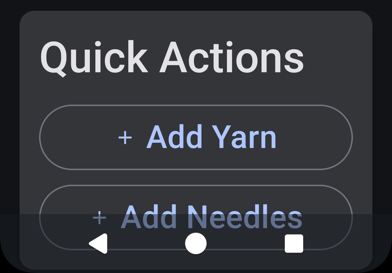
I personally use the button navigation (so, not the gesture navigation), and surprisingly many apps have this same problem.
In Summary
As mentioned before, I liked Claude’s app the most from the UI perspective. From an accessibility perspective, the generated app wasn’t too bad – it did have accessibility issues, but not as many as, for example, Gemini’s first attempt.
However, this was the first time in my tests when I got some hallucinations. The hallucinated code wasn’t actually used by the app, but it could have been.
The results didn’t surprise me. I’ve reached the point of saturation, so it’s time to write the summary post for all the tests I’ve been running over the last few months. So, stay tuned, that’s coming next.
Links in Blog Post

