Testimonials play a crucial role in digital marketing as they serve as social proof of product quality and customer satisfaction. However, a common issue with testimonials is that they often lack visual appeal. In a previous tutorial, we showed how to build a fancy testimonial slider using Tailwind CSS; now, we are doubling down, drawing inspiration from the cool shot by the Significa team. Breaking away from the ordinary, we will build an unconventional testimonial component that looks original while ensuring a good user experience.
Creating the HTML structure
We are going to create a section made of text and images of clients. On hovering over the image, a tooltip will appear with the endorsement message. To create this component, we will use Tailwind CSS and Alpine.js. Alternating text with images may seem simple, but it’s trickier than one may think, especially when it comes to align the elements vertically without affecting the line-height of the text. To save time and focus on the functionality, we’ve prepared the basic HTML structure with the Tailwind CSS utility classes:
class="text-center">
class="font-nycd text-xl text-indigo-500 mb-4">
class="relative inline-flex">
Our promise
class="text-5xl leading-tight font-bold text-slate-900">
We'll help you boost your revenues
class="relative inline-flex justify-center w-[52px] h-[52px] align-middle -translate-y-1">
manage payrolls
class="relative inline-flex justify-center w-[52px] h-[52px] align-middle -translate-y-1">
and save up to 50+ hours in duties every month
class="relative inline-flex justify-center w-[52px] h-[52px] align-middle -translate-y-1">
Now, let’s add the tooltips:
class="text-center">
class="font-nycd text-xl text-indigo-500 mb-4">
class="relative inline-flex">
Our promise
class="text-5xl leading-tight font-bold text-slate-900">
We'll help you boost your revenues
class="relative inline-flex justify-center w-[52px] h-[52px] align-middle -translate-y-1 z-50">
id="testimonial-01" role="tooltip" class="absolute top-full pt-5">
class="relative w-80 after:absolute after:-top-1.5 after:left-1/2 after:-translate-x-1/2 after:h-3 after:w-3 after:rounded-tl-sm after:rotate-45 after:bg-slate-900">
class="relative bg-slate-900 p-5 rounded-3xl shadow-xl text-left text-sm text-slate-200 font-medium space-y-3">
This component is AWESOME. The hover feature is well-thought-out. Even the smaller details, like using colors, really helps everything stay organized. Cruip is amazing and I really enjoy using it.
Mary Smith class="text-slate-600">- class="text-slate-400">Software Engineer
manage payrolls
class="relative inline-flex justify-center w-[52px] h-[52px] align-middle -translate-y-1 z-40">
id="testimonial-02" role="tooltip" class="absolute top-full pt-5">
class="relative w-80 after:absolute after:-top-1.5 after:left-1/2 after:-translate-x-1/2 after:h-3 after:w-3 after:rounded-tl-sm after:rotate-45 after:bg-slate-900">
class="relative bg-slate-900 p-5 rounded-3xl shadow-xl text-left text-sm text-slate-200 font-medium space-y-3">
This component is AWESOME. The hover feature is well-thought-out. Even the smaller details, like using colors, really helps everything stay organized. Cruip is amazing and I really enjoy using it.
Mary Smith class="text-slate-600">- class="text-slate-400">Software Engineer
and save up to 50+ hours in duties every month
class="relative inline-flex justify-center w-[52px] h-[52px] align-middle -translate-y-1 z-30">
id="testimonial-03" role="tooltip" class="absolute top-full pt-5 [&[x-cloak]]:hidden">
class="relative w-80 after:absolute after:-top-1.5 after:left-1/2 after:-translate-x-1/2 after:h-3 after:w-3 after:rounded-tl-sm after:rotate-45 after:bg-slate-900">
class="relative bg-slate-900 p-5 rounded-3xl shadow-xl text-left text-sm text-slate-200 font-medium space-y-3">
This component is AWESOME. The hover feature is well-thought-out. Even the smaller details, like using colors, really helps everything stay organized. Cruip is amazing and I really enjoy using it.
Mary Smith class="text-slate-600">- class="text-slate-400">Software Engineer
Currently, these tooltips are all visible – we will see later how to hide them with Alpine.js. Notice the strategic use of z-50, z-40, and z-30 classes to control the stacking order and prevent tooltips from being covered by underlying images.
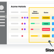
Toggling tooltip visibility
Now, we need to integrate some JavaScript logic to handle tooltip visibility, so add an x-data attribute to the element containing the image:
class="relative inline-flex justify-center w-[52px] h-[52px] align-middle -translate-y-1 z-40" x-data="{ open: false }">
Within this directive, we have defined a open property initially set to false, indicating that the tooltip is initially hidden. Next, we want open to become true on hovering over the button, and false when the cursor exits the parent element. To do this, we’ll add a @mouseover event to the button and @mouseover.outside to its wrapper:
class="relative inline-flex justify-center w-[52px] h-[52px] align-middle -translate-y-1 z-50" x-data="{ open: false }" @mouseover.outside="open = false">
...
Lastly, we’ll apply Alpine.js transition utilities for the fade-in/fade-out effect:
id="testimonial-01"
role="tooltip"
class="absolute top-full pt-5 [&[x-cloak]]:hidden"
x-cloak
>
class="relative w-80 after:absolute after:-top-1.5 after:left-1/2 after:-translate-x-1/2 after:h-3 after:w-3 after:rounded-tl-sm after:rotate-45 after:bg-slate-900"
x-show="open"
x-transition:enter="transition ease-[cubic-bezier(.5,.85,.25,1.8)] duration-200 delay-100"
x-transition:enter-start="opacity-0 translate-y-2"
x-transition:enter-end="opacity-100 translate-y-0"
x-transition:leave="transition ease-[cubic-bezier(.5,.85,.25,1.8)] duration-100 delay-100"
x-transition:leave-start="opacity-100"
x-transition:leave-end="opacity-0"
>
class="relative bg-slate-900 p-5 rounded-3xl shadow-xl text-left text-sm text-slate-200 font-medium space-y-3">
This component is AWESOME. The hover feature is well-thought-out. Even the smaller details, like using colors, really helps everything stay organized. Cruip is amazing and I really enjoy using it.
Mary Smith class="text-slate-600">- class="text-slate-400">Software Engineer
Great! Now, the tooltip is hidden by default and fades in – with a subtle vertical translation – when you hover over the image. Also, notice that we have used the x-cloak attribute to prevent the tooltip from briefly appearing before Alpine.js is fully loaded.
Handling keyboard navigation
If you’ve been following our previous tutorials, you know how important accessibility is to us. That’s why, when it comes to implementing this component, we’ll make sure that the content can be easily navigated using the keyboard by simply pressing the Tab key. So, let’s complete the integration of the button with the addition of a focus event:
Now, the tooltip becomes visible when the button receives focus too. However, we still need to close the tooltip when the container element loses focus:
class="relative inline-flex justify-center w-[52px] h-[52px] align-middle -translate-y-1 z-50"
x-data="{ open: false }"
@mouseover.outside="open = false"
@focusout="await $nextTick();!$el.contains($focus.focused()) && (open = false)"
>
At this point, you might be wondering why we didn’t just use the expression open = false for the @mouseover event . Well, if there are links or other focusable elements inside the tooltip, we shouldn’t close it! That’s why we utilized the focus plugin of Alpine.js to determine if the focused element is within the tooltip. If it’s not, then we can close the tooltip.
Prevent tooltip overflow
Now, let’s ensure the tooltip doesn’t overflow the viewport, especially on varying screen sizes. In cases where the tooltip goes outside the screen, particularly on smaller displays, we’ll use a few lines of JavaScript to dynamically adjust its positioning. To start, assign an x-ref="tooltip" to the tooltip’s container and add an x-init directive to the element defining the background color:
id="testimonial-01"
role="tooltip"
class="absolute top-full pt-5 [&[x-cloak]]:hidden"
x-ref="tooltip"
x-cloak
>
class="relative w-80 after:absolute after:-top-1.5 after:left-1/2 after:-translate-x-1/2 after:h-3 after:w-3 after:rounded-tl-sm after:rotate-45 after:bg-slate-900"
x-show="open"
x-transition:enter="transition ease-[cubic-bezier(.5,.85,.25,1.8)] duration-200 delay-100"
x-transition:enter-start="opacity-0 translate-y-2"
x-transition:enter-end="opacity-100 translate-y-0"
x-transition:leave="transition ease-[cubic-bezier(.5,.85,.25,1.8)] duration-100 delay-100"
x-transition:leave-start="opacity-100"
x-transition:leave-end="opacity-0"
>
class="relative bg-slate-900 p-5 rounded-3xl shadow-xl text-left text-sm text-slate-200 font-medium space-y-3"
x-init="$watch('open', value => { $nextTick(() => {
$refs.tooltip.getBoundingClientRect().left < 0 ? $el.style.left = Math.abs($refs.tooltip.getBoundingClientRect().left) + $root.getBoundingClientRect().left - 4 + 'px' : $el.style.left = null;
$refs.tooltip.getBoundingClientRect().right > document.documentElement.offsetWidth ? $el.style.right = Math.abs($refs.tooltip.getBoundingClientRect().right) - $root.getBoundingClientRect().right - 4 + 'px' : $el.style.right = null;
} )} )"
>
This component is AWESOME. The hover feature is well-thought-out. Even the smaller details, like using colors, really helps everything stay organized. Cruip is amazing and I really enjoy using it.
Mary Smith class="text-slate-600">- class="text-slate-400">Software Engineer
In the code above, the $watch method from Alpine.js monitors changes in the open property. When it detects a change, it triggers a function that adjusts the tooltip’s position:
- If the toolptip overflows the screen to the left, it moves the tooltip right.
- If the toolptip overflows the screen to the right, it moves the tooltip left.
This addition ensures the tooltip remains within the screen boundaries.
Lower sibling opacity on interaction
So far, the component is perfectly functional and accessible, but let’s add a subtle enhancement. When a user hovers over an image, we want to decrease the opacity of all other elements. To do this, we’ll assign a class bound to the open property:
class="relative inline-flex justify-center w-[52px] h-[52px] align-middle -translate-y-1 z-50"
x-data="{ open: false }"
:class="{ 'active': open }"
@mouseover.outside="open = false"
@focusout="await $nextTick();!$el.contains($focus.focused()) && (open = false)"
> ...
In essence, when open is true, the active class is added to the container element. Now, we can use this class to lower the opacity of sibling elements. For those unfamiliar with CSS, the subsequent-sibling combinator (~) can select elements that are siblings occurring after a specific element. So, to lower the opacity of subsequent-sibling elements, we can use the custom class [&.active~*]:opacity-25 on all elements containing text and images. Now, to address the challenge of lowering opacity for preceding elements, we can use the ~ combinator in conjunction with the :has() pseudo-class. This ensures all preceding elements are selected, as explained by Tobias Ahlin Bjerrome. The resulting class is [&:has(~.active)]:opacity-25. Finally, add the transition-opacity and duration-200 classes for a smooth opacity transition effect. With the changes just made, our component is now complete:
class="text-center">
class="font-nycd text-xl text-indigo-500 mb-4">
class="relative inline-flex">
Our promise
class="text-5xl leading-tight font-bold text-slate-900">
class="[&:has(~.active)]:opacity-25 [&.active~*]:opacity-25 transition-opacity duration-200">We'll help you boost your revenues
class="[&:has(~.active)]:opacity-25 [&.active~*]:opacity-25 transition-opacity duration-200 relative inline-flex justify-center w-[52px] h-[52px] align-middle -translate-y-1 z-50"
x-data="{ open: false }"
:class="{ 'active': open }"
@mouseover.outside="open = false"
@focusout="await $nextTick();!$el.contains($focus.focused()) && (open = false)"
>
id="testimonial-01"
role="tooltip"
class="absolute top-full pt-5 [&[x-cloak]]:hidden"
x-ref="tooltip"
x-cloak
>
class="relative w-80 after:absolute after:-top-1.5 after:left-1/2 after:-translate-x-1/2 after:h-3 after:w-3 after:rounded-tl-sm after:rotate-45 after:bg-slate-900"
x-show="open"
x-transition:enter="transition ease-[cubic-bezier(.5,.85,.25,1.8)] duration-200 delay-100"
x-transition:enter-start="opacity-0 translate-y-2"
x-transition:enter-end="opacity-100 translate-y-0"
x-transition:leave="transition ease-[cubic-bezier(.5,.85,.25,1.8)] duration-100 delay-100"
x-transition:leave-start="opacity-100"
x-transition:leave-end="opacity-0"
>
class="relative bg-slate-900 p-5 rounded-3xl shadow-xl text-left text-sm text-slate-200 font-medium space-y-3"
x-init="$watch('open', value => { $nextTick(() => {
$refs.tooltip.getBoundingClientRect().left < 0 ? $el.style.left = Math.abs($refs.tooltip.getBoundingClientRect().left) + $root.getBoundingClientRect().left - 4 + 'px' : $el.style.left = null;
$refs.tooltip.getBoundingClientRect().right > document.documentElement.offsetWidth ? $el.style.right = Math.abs($refs.tooltip.getBoundingClientRect().right) - $root.getBoundingClientRect().right - 4 + 'px' : $el.style.right = null;
} )} )"
>
This component is AWESOME. The hover feature is well-thought-out. Even the smaller details, like using colors, really helps everything stay organized. Cruip is amazing and I really enjoy using it.
Mary Smith class="text-slate-600">- class="text-slate-400">Software Engineer
class="[&:has(~.active)]:opacity-25 [&.active~*]:opacity-25 transition-opacity duration-200">manage payrolls
class="[&:has(~.active)]:opacity-25 [&.active~*]:opacity-25 transition-opacity duration-200 relative inline-flex justify-center w-[52px] h-[52px] align-middle -translate-y-1 z-40"
x-data="{ open: false }"
:class="{ 'active': open }"
@mouseover.outside="open = false"
@focusout="await $nextTick();!$el.contains($focus.focused()) && (open = false)"
>
id="testimonial-02"
role="tooltip"
class="absolute top-full pt-5 [&[x-cloak]]:hidden"
x-ref="tooltip"
x-cloak
>
class="relative w-80 after:absolute after:-top-1.5 after:left-1/2 after:-translate-x-1/2 after:h-3 after:w-3 after:rounded-tl-sm after:rotate-45 after:bg-slate-900"
x-show="open"
x-transition:enter="transition ease-[cubic-bezier(.5,.85,.25,1.8)] duration-200 delay-100"
x-transition:enter-start="opacity-0 translate-y-2"
x-transition:enter-end="opacity-100 translate-y-0"
x-transition:leave="transition ease-[cubic-bezier(.5,.85,.25,1.8)] duration-100 delay-100"
x-transition:leave-start="opacity-100"
x-transition:leave-end="opacity-0"
>
class="relative bg-slate-900 p-5 rounded-3xl shadow-xl text-left text-sm text-slate-200 font-medium space-y-3"
x-init="$watch('open', value => { $nextTick(() => {
$refs.tooltip.getBoundingClientRect().left < 0 ? $el.style.left = Math.abs($refs.tooltip.getBoundingClientRect().left) + $root.getBoundingClientRect().left - 4 + 'px' : $el.style.left = null;
$refs.tooltip.getBoundingClientRect().right > document.documentElement.offsetWidth ? $el.style.right = Math.abs($refs.tooltip.getBoundingClientRect().right) - $root.getBoundingClientRect().right - 4 + 'px' : $el.style.right = null;
} )} )"
>
This component is AWESOME. The hover feature is well-thought-out. Even the smaller details, like using colors, really helps everything stay organized. Cruip is amazing and I really enjoy using it.
Mary Smith class="text-slate-600">- class="text-slate-400">Software Engineer
class="[&:has(~.active)]:opacity-25 [&.active~*]:opacity-25 transition-opacity duration-200">and save up to 50+ hours in duties every month
class="[&:has(~.active)]:opacity-25 [&.active~*]:opacity-25 transition-opacity duration-200 relative inline-flex justify-center w-[52px] h-[52px] align-middle -translate-y-1 z-30"
x-data="{ open: false }"
:class="{ 'active': open }"
@mouseover.outside="open = false"
@focusout="await $nextTick();!$el.contains($focus.focused()) && (open = false)"
>
id="testimonial-03"
role="tooltip"
class="absolute top-full pt-5 [&[x-cloak]]:hidden"
x-ref="tooltip"
x-cloak
>
class="relative w-80 after:absolute after:-top-1.5 after:left-1/2 after:-translate-x-1/2 after:h-3 after:w-3 after:rounded-tl-sm after:rotate-45 after:bg-slate-900"
x-show="open"
x-transition:enter="transition ease-[cubic-bezier(.5,.85,.25,1.8)] duration-200 delay-100"
x-transition:enter-start="opacity-0 translate-y-2"
x-transition:enter-end="opacity-100 translate-y-0"
x-transition:leave="transition ease-[cubic-bezier(.5,.85,.25,1.8)] duration-100 delay-100"
x-transition:leave-start="opacity-100"
x-transition:leave-end="opacity-0"
>
class="relative bg-slate-900 p-5 rounded-3xl shadow-xl text-left text-sm text-slate-200 font-medium space-y-3"
x-init="$watch('open', value => { $nextTick(() => {
$refs.tooltip.getBoundingClientRect().left < 0 ? $el.style.left = Math.abs($refs.tooltip.getBoundingClientRect().left) + $root.getBoundingClientRect().left - 4 + 'px' : $el.style.left = null;
$refs.tooltip.getBoundingClientRect().right > document.documentElement.offsetWidth ? $el.style.right = Math.abs($refs.tooltip.getBoundingClientRect().right) - $root.getBoundingClientRect().right - 4 + 'px' : $el.style.right = null;
} )} )"
>
This component is AWESOME. The hover feature is well-thought-out. Even the smaller details, like using colors, really helps everything stay organized. Cruip is amazing and I really enjoy using it.
Mary Smith class="text-slate-600">- class="text-slate-400">Software Engineer
Conclusions
This tutorial is yet another demonstration of how powerful and versatile the Tailwind CSS + Alpine.js combo is. With just a few lines of code – all within the HTML document! – we have created an interactive, accessible, and responsive component. If you’ve found this tutorial useful, we recommend checking out our HTML templates built with Tailwind, all designed with Alpine.js. Feel free to experiment further, customize the component to suit your needs, and explore additional features that Tailwind CSS and Alpine.js have to offer. Happy coding!