
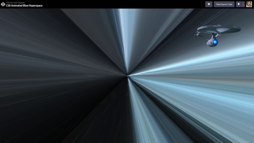
I’ve create a CSS only wormhole with the Starship Enterprise flying through it at light speed!
Discuss! What do you think? Please Leave your options and suggestions to improve the code below!
Here is some of the code.
HTML
CSS
Make sure to fill in the background-image src. You can find it in the source code on codepen.io.
wall{
  background: url(https://i.imgur.com/i1xdL.jpeg);
  background-size: cover;
}

html, body{
  height: 100%;
  width: 100%;
  overflow: hidden;
  margin: 0;
}

body{
  background: #000;
  text-align: center;
}

body:before {
  content: '';
  display: inline-block;
  height: 100%;
  vertical-align: middle;
}

.scene {
  display: inline-block;
  vertical-align: middle;
  perspective: 5px;
  perspective-origin: 50% 50%;
  position: relative;
}

.wrap{
  position: absolute;
  width: 1000px;
  height: 1000px;
  left: -500px;
  top: -500px;
  transform-style: preserve-3d;
  animation: move 20s infinite linear;
  animation-fill-mode: forwards;
}

/* .wrap:nth-child(2){
  animation: move 20s infinite linear;
  animation-delay: 6s;
} */

.wall {
  width: 100%;
  height: 100%;
  position: absolute;
/*   animation: fade 20s infinite linear; */
  animation-delay: 0;
}

.wrap:nth-child(2) .wall {
  animation-delay: 6s;
}

.wall-back {
  opacity: 0.5;
}

.wrap .wall-right {
  transform: rotateY(90deg) translateZ(500px);
}

.wrap .wall-left {
  transform: rotateY(-90deg) translateZ(500px);
}

.wrap .wall-top {
  transform: rotateX(90deg) translateZ(500px);
}

.wrap .wall-bottom {
  transform: rotateX(-90deg) translateZ(500px);
}

.wrap .wall-back {
  transform: rotateX(180deg) translateZ(500px);
}

@keyframes move {
  0%{
    transform: translateZ(500px) rotate(0deg);
  }
  100%{
    transform: translateZ(-500px) rotate(0deg);
  }
}

@keyframes fade {
  0%{
    opacity: 0;
  }
  25% {
    opacity: 1;
  }
  75% {
    opacity: 1;
  }
  100%{
    opacity: 0;
  }
}

.ship {
  position: absolute;
  z-index: 1;
  top: 120px;
  right: 100px;
  bottom: 0;
  height: 170px;
  width: 350px;
  background-size: cover;
  background-repeat: no-repeat;
  background-position: center center;
  background-image: url('Too Big');
}

@keyframes 🤫 {
  0%{
    filter: hue-rotate(0)
  }
  50% {
    filter: hue-rotate(180deg) saturation(5);
    transform: scaleX(4000);
    perspective: 50px;
  }

  100%{
    filter: hue-rotate(360deg);
  }
}
You can checkout more web development articles and resources on AppCode.


