
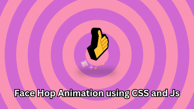
Here is the cool Face Hop animation using CSS and Js.
HTML
Here is the HTML part
Face Hop Animation using CSS and Js
Here, the script type is the module
CSS
Now, let’s add some CSS
@charset "UTF-8";
@import url("https://cdn.skypack.dev/that-3d-text-library/lib/styles.css");
@import url("https://fonts.googleapis.com/css2?family=Bakbak+One&family=Caprasimo&family=Chonburi&family=Graduate&family=Righteous&display=swap");
:root {
  --font-size: clamp(100px, 40vmin, 200px);
}

html, body {
  overflow: hidden;
  width: 100%;
  height: 100%;
  margin: 0;
  padding: 0;
  position: relative;
}

body {
  display: flex;
  align-items: flex-end;
  justify-content: center;
  perspective: 700px;
}
body::after {
  position: absolute;
  background: linear-gradient(0deg, rgba(0, 0, 0, 0.04), rgba(0, 0, 0, 0));
  width: 100%;
  height: 45%;
  top: 0;
  left: 0;
  z-index: 1;
}
body > * {
  z-index: 2;
}

.container, .squish {
  transform-style: preserve-3d;
  position: relative;
}

.container {
  margin-bottom: calc(50vh - var(--font-size));
}

.squish {
  z-index: 2;
}

.shadow {
  transform-style: flat;
  z-index: 1;
  transform: translatex(-10%) translatez(-30px);
  position: absolute;
  bottom: calc(var(--font-size) * 0.25);
  left: 0;
  width: 120%;
  height: calc(var(--font-size) * 0.15);
  opacity: 1;
  background-color: var(--shadow-color, black);
  border-radius: 100vmin;
  filter: blur(25px);
}

h1 {
  --layers: 10;
  --depth: 30;
  font-size: var(--font-size);
}

.particles {
  position: absolute;
  left: 50%;
  z-index: 1;
  transform: translatez(-50px);
  bottom: calc(var(--font-size) * 0.3);
}
.particles .floor div,
.particles .air div {
  transform-style: preserve-3d;
  display: block;
  position: absolute;
  top: 0;
  left: 0;
}
.particles .floor div::after,
.particles .air div::after {
  content: "";
  position: absolute;
  top: 0;
  left: 0;
  transform: translate(-50%, -50%);
  border-radius: 50%;
}
.particles .floor {
  transform: rotatex(-60deg);
}
.particles .floor div::after {
  border: solid 1.5vmin var(--floor-particle, white);
  width: 8vmin;
  height: 8vmin;
}
.particles .air div::after {
  content: "★";
  color: var(--air-particle, white);
  font-size: 10vmin;
}
.particles .air div:nth-child(2n)::after {
  color: var(--air-particle-alt, hotpink);
}
.particles .air .p0::after {
  content: "●";
}
.particles .air .p1::after {
  content: "✖︎";
}
.particles .air .p2::after {
  content: "◼︎";
}
.particles .air .p3::after {
  content: "▲";
}

.style-0 {
  --color: white;
  --color-front: black;
  --floor-particle: black;
  --air-particle: black;
  --air-particle-alt: white;
  background-color: yellow;
}
.style-0 [data-mod-3] {
  --color: black;
}

.style-2 {
  --color: #3066BE;
  --color-front: #6D9DC5;
  --floor-particle: transparent;
  --air-particle: transparent;
  --air-particle-alt: transparent;
  background-color: #6D9DC5;
  background: url('data:image/svg+xml,%3Csvg xmlns="http://www.w3.org/2000/svg" width="200" height="200" viewBox="0 0 100 100"%3E%3Cg fill-rule="evenodd"%3E%3Cg fill="%23ffffff" fill-opacity="0.4"%3E%3Cpath opacity=".5" d="M96 95h4v1h-4v4h-1v-4h-9v4h-1v-4h-9v4h-1v-4h-9v4h-1v-4h-9v4h-1v-4h-9v4h-1v-4h-9v4h-1v-4h-9v4h-1v-4h-9v4h-1v-4H0v-1h15v-9H0v-1h15v-9H0v-1h15v-9H0v-1h15v-9H0v-1h15v-9H0v-1h15v-9H0v-1h15v-9H0v-1h15v-9H0v-1h15V0h1v15h9V0h1v15h9V0h1v15h9V0h1v15h9V0h1v15h9V0h1v15h9V0h1v15h9V0h1v15h9V0h1v15h4v1h-4v9h4v1h-4v9h4v1h-4v9h4v1h-4v9h4v1h-4v9h4v1h-4v9h4v1h-4v9h4v1h-4v9zm-1 0v-9h-9v9h9zm-10 0v-9h-9v9h9zm-10 0v-9h-9v9h9zm-10 0v-9h-9v9h9zm-10 0v-9h-9v9h9zm-10 0v-9h-9v9h9zm-10 0v-9h-9v9h9zm-10 0v-9h-9v9h9zm-9-10h9v-9h-9v9zm10 0h9v-9h-9v9zm10 0h9v-9h-9v9zm10 0h9v-9h-9v9zm10 0h9v-9h-9v9zm10 0h9v-9h-9v9zm10 0h9v-9h-9v9zm10 0h9v-9h-9v9zm9-10v-9h-9v9h9zm-10 0v-9h-9v9h9zm-10 0v-9h-9v9h9zm-10 0v-9h-9v9h9zm-10 0v-9h-9v9h9zm-10 0v-9h-9v9h9zm-10 0v-9h-9v9h9zm-10 0v-9h-9v9h9zm-9-10h9v-9h-9v9zm10 0h9v-9h-9v9zm10 0h9v-9h-9v9zm10 0h9v-9h-9v9zm10 0h9v-9h-9v9zm10 0h9v-9h-9v9zm10 0h9v-9h-9v9zm10 0h9v-9h-9v9zm9-10v-9h-9v9h9zm-10 0v-9h-9v9h9zm-10 0v-9h-9v9h9zm-10 0v-9h-9v9h9zm-10 0v-9h-9v9h9zm-10 0v-9h-9v9h9zm-10 0v-9h-9v9h9zm-10 0v-9h-9v9h9zm-9-10h9v-9h-9v9zm10 0h9v-9h-9v9zm10 0h9v-9h-9v9zm10 0h9v-9h-9v9zm10 0h9v-9h-9v9zm10 0h9v-9h-9v9zm10 0h9v-9h-9v9zm10 0h9v-9h-9v9zm9-10v-9h-9v9h9zm-10 0v-9h-9v9h9zm-10 0v-9h-9v9h9zm-10 0v-9h-9v9h9zm-10 0v-9h-9v9h9zm-10 0v-9h-9v9h9zm-10 0v-9h-9v9h9zm-10 0v-9h-9v9h9zm-9-10h9v-9h-9v9zm10 0h9v-9h-9v9zm10 0h9v-9h-9v9zm10 0h9v-9h-9v9zm10 0h9v-9h-9v9zm10 0h9v-9h-9v9zm10 0h9v-9h-9v9zm10 0h9v-9h-9v9z"https://dev.to/%3E%3Cpath d="M6 5V0H5v5H0v1h5v94h1V6h94V5H6z"/%3E%3C/g%3E%3C/g%3E%3C/svg%3E'), radial-gradient(#6D9DC5, #3066BE);
}
.style-2::after {
  content: none;
}
.style-2 .shadow {
  display: none;
}
.style-2 .front {
  text-shadow: -2px -2px 0 #fff, 2px -2px 0 #fff, -2px 2px 0 #fff, 2px 2px 0 #fff;
}

.style-3 {
  --color: #B79492;
  --color-front: #EAE1DF;
  --floor-particle: #B79492;
  --air-particle: orange;
  --air-particle-alt: #B79492;
  --background-color: #917C78;
}

.style-4 {
  --color: #DB504A;
  --color-front: #E3B505;
  --floor-particle: #E3B505;
  --air-particle: #DB504A;
  --air-particle-alt: #E3B505;
  background-color: #084C61;
}

.style-5 {
  background: repeating-linear-gradient(45deg, red, red 10vmin, white 10vmin, white 20vmin);
  --color: red;
  --color-front: white;
  --floor-particle: transparent;
  --air-particle: transparent;
  --air-particle-alt: transparent;
}
.style-5::after {
  content: none;
}

.style-6 {
  --color: #424C55;
  --color-front: #E3B505;
  --floor-particle: #E3B505;
  --air-particle: #424C55;
  --air-particle-alt: #E3B505;
  background-color: #D1CCDC;
}

.style-7 {
  --color: #6CCFF6;
  --color-front: #001011;
  --floor-particle: #FFFFFC;
  --air-particle: #FFFFFC;
  --air-particle-alt: #FFFFFC;
  background-color: #00393D;
}

.style-8 {
  --color: #F9DC5C;
  --color-front: #ED254E;
  --floor-particle: #ED254E;
  --air-particle: #ED254E;
  --air-particle-alt: #F9DC5C;
  background-color: #F4FFFD;
}

.style-9 {
  background-color: #42E2B8;
  background-image: url('data:image/svg+xml,%3Csvg fill="%23F3DFBF" width="100" height="100" viewBox="0 0 64 64" xmlns="http://www.w3.org/2000/svg"%3E%3Cpath d="M8 16c4.418 0 8-3.582 8-8s-3.582-8-8-8-8 3.582-8 8 3.582 8 8 8zm0-2c3.314 0 6-2.686 6-6s-2.686-6-6-6-6 2.686-6 6 2.686 6 6 6zm33.414-6l5.95-5.95L45.95.636 40 6.586 34.05.636 32.636 2.05 38.586 8l-5.95 5.95 1.414 1.414L40 9.414l5.95 5.95 1.414-1.414L41.414 8zM40 48c4.418 0 8-3.582 8-8s-3.582-8-8-8-8 3.582-8 8 3.582 8 8 8zm0-2c3.314 0 6-2.686 6-6s-2.686-6-6-6-6 2.686-6 6 2.686 6 6 6zM9.414 40l5.95-5.95-1.414-1.414L8 38.586l-5.95-5.95L.636 34.05 6.586 40l-5.95 5.95 1.414 1.414L8 41.414l5.95 5.95 1.414-1.414L9.414 40z"  fill-rule="evenodd"/%3E%3C/svg%3E');
  --color: #F3DFBF;
  --color-front: #EB8A90;
  --floor-particle: #EB8A90;
  --air-particle: #EB8A90;
  --air-particle-alt: #F3DFBF;
}
.style-9::after {
  content: none;
}

.style-10 {
  --color: #138A36;
  --color-front: #34403A;
  --floor-particle: #ffffff;
  --air-particle: #ffffff;
  --air-particle-alt: #ffffff;
  background-color: #18FF6D;
}

.style-11 {
  --color: #FFA69E;
  --color-front: #DDFFF7;
  --floor-particle: #AA4465;
  --air-particle: #AA4465;
  --air-particle-alt: #462255;
  background-color: #93E1D8;
}

.style-12 {
  --color: #64B6AC;
  --color-front: #FEE9E1;
  --floor-particle: #64B6AC;
  --air-particle: #64B6AC;
  --air-particle-alt: #64B6AC;
  background-color: #FEE9E1;
}

.style-13 {
  --color: #F4D58D;
  --color-front: #BF0603;
  --floor-particle: #708D81;
  --air-particle: #708D81;
  --air-particle-alt: #001427;
  background-color: #8D0801;
}

.style-14 {
  --color: #BB4430;
  --color-front: #7EBDC2;
  --floor-particle: #7EBDC2;
  --air-particle: #BB4430;
  --air-particle-alt: #7EBDC2;
  background-color: #231F20;
}

.style-15 {
  background: repeating-radial-gradient(circle farthest-side, #F487B6, #F487B6 10vmin, #CC59D2 10vmin, #CC59D2 20vmin);
  --color: #FDE12D;
  --color-front: #9046CF;
  --floor-particle: transparent;
  --air-particle: #FDE12D;
  --air-particle-alt: #FFF3F0;
}
.style-15::after {
  content: none;
}

.font-0 {
  font-family: "Bakbak One", cursive;
}

.font-1 {
  font-family: "Graduate", cursive;
}

.font-2 {
  font-family: "Chonburi", cursive;
}

.font-3 {
  font-family: "Righteous", cursive;
}
JavaScript
Let’s add our JavaScript module
import { Those3DTexts } from "https://cdn.skypack.dev/that-3d-text-library";
import { gsap } from "https://cdn.skypack.dev/gsap";
import { MotionPathPlugin } from "https://cdn.skypack.dev/gsap/MotionPathPlugin";

gsap.registerPlugin(MotionPathPlugin);

const letters = ['', '', '', '', '', '', '', '', '', ''];

new Those3DTexts();

const STYLE_COUNT = 16;
const FONT_COUNT = 1;
const BOUNCE_DURATION = 1.3;
const BOUNCE_HEIGHT = -90;
const BOUNCE_WOBBLE = 0.75; // lower = more wobble
const FLOOR_PARTICLE_COUNT = 1;
const AIR_PARTICLE_COUNT =4;

const LETTER = document.querySelector('h1')
const BODY = document.body

let count = 0;

BODY.classList.add('style-0');
LETTER.classList.add('font-0');

const setNextStyle = () => {

  BODY.classList.remove(`style-${count % (STYLE_COUNT)}`);
  LETTER.classList.remove(`font-${count % (FONT_COUNT)}`);
  count++;
  BODY.classList.add(`style-${count % (STYLE_COUNT)}`);
  LETTER.classList.add(`font-${count % (FONT_COUNT)}`);
}

const particles = {
  floor: [],
  air: []
}

const setupParticles = () => {

  const floor = document.querySelector('.floor');
  const air = document.querySelector('.air');

  for(let i = 0; i < FLOOR_PARTICLE_COUNT; i++) {
    let particle = document.createElement('div');
    floor.appendChild(particle)
    particles.floor.push(particle)
  }

  for(let i = 0; i < AIR_PARTICLE_COUNT; i++) {
    let particle = document.createElement('div');
    air.appendChild(particle)
    particles.air.push(particle)
  }
}

setupParticles()


let letterCount = 0

const nextLetter = () => {
  letterCount ++;
  const letterElements = LETTER.querySelectorAll('span')
  letterElements.forEach(l => l.innerText = letters[letterCount % letters.length])
}

const glitch = () => {
  gsap.to('h1 span', {keyframes: [{opacity: 'random(0, 1)', xPercent: 'random(-10, 10)', opacity: 'random(0, 1)', yPercent: 'random(-10, 10)'}, {opacity: 'random(0, 1)', xPercent: 'random(-20, 20)', yPercent: 'random(-20, 20)'}, {opacity: 'random(0, 1)', xPercent: 'random(-10, 10)', yPercent: 'random(-10, 10)'}, {opacity: 1, xPercent: 0, yPercent: 0}], yoyo: true, ease: 'power4.inOut', duration: BOUNCE_DURATION * 0.5})
}

const bounce = () => {
  const tl = gsap.timeline({defaults: { duration: BOUNCE_DURATION * 0.5}, onComplete: () => {
    setNextStyle();
    nextLetter();
    bounce();
  }})
  tl.set('.squish', {scaleY: BOUNCE_WOBBLE, scaleX: 1 + (1 - BOUNCE_WOBBLE)})
  tl.to('.squish', {scaleY: 1, scaleX: 1, duration: BOUNCE_DURATION * 0.6, ease: 'elastic'}, 0)
  tl.to(LETTER, {yPercent: BOUNCE_HEIGHT, ease: 'circ.out'}, 0)
  tl.to('.shadow', {opacity: 0.2, ease: 'circ.out'}, 0)
  tl.to(LETTER, {yPercent: 10, ease: 'circ.in'}, BOUNCE_DURATION * 0.5)
  tl.to('.shadow', {opacity: 1, ease: 'circ.in'}, BOUNCE_DURATION * 0.5)
  tl.to(LETTER, {rotationZ: "random(-150, 150)", rotationY: "random(-50, 50)", rotationX: "random(-50, 50)", duration: BOUNCE_DURATION, ease: 'none'}, 0)
  // tl.to('.squish', {scaleY: BOUNCE_WOBBLE, duration: 0.2}, '-=0.2')


  gsap.fromTo(particles.floor, {x: 0, y: 0,  scale: 1, opacity: 0.7}, {duration:  Math.min(BOUNCE_DURATION, 0.7 + Math.random() * 0.8), ease: 'power4.out', opacity: 0, scale: 2.5})

  particles.air.forEach((particle) => {
    particle.setAttribute('class', `p${Math.floor(Math.random() * 4)}`)
    gsap.fromTo(particle, {opacity: 1, x: 0, y: 0, z: 0, scale: 'random(0.3, 1)'}, {
      duration: Math.min(BOUNCE_DURATION, 0.3 + Math.random() * 0.3),
      ease: 'linear',
      opacity: 0,
      rotate: 'random(-100, 100)',
      x: 'random(-250, 250)',
      y: 'random(-200, -100)',
      z: 'random(-400, 400)',
    })
  })

  if(Math.random() > 0.95) glitch()
}

bounce();
**Boom! **There you have it.
Output
Source Code
The Source Code of this project is available on CodePen – Face Hop animation
The Source Code of this project is available on GitHub – Face Hop animation

