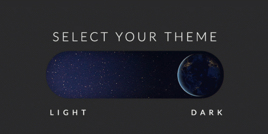
Setting Up Dark and Light Themes in Next.js 15 with Tailwind CSS
In this blog, we’ll walk you through the process of adding dynamic dark and light theme support to your Next.js 13 project using the next-themes library. With this setup, users can easily switch between themes, and your application’s styles will adjust accordingly.
Prerequisites – Node.js and npm (or yarn) installed on your system.
Step 1: Create a Next.js 15 Project If you haven’t already, create a Next.js 15 project by running the following commands:
npx create-next-app your-project
cd your-project
Step 2: Install next-themes
Install the next-themes library using npm or yarn:
npm install next-themes
# or
yarn add next-themes
Step 3: Configure the Theme Provider
In your Next.js project, you need to set up the ThemeProvider from next-themes in your app directory. So create a file provider.tsx in your app directory (Note: i.e provider.tsx but your are feel free to give any name of ThemeProvider file)
// /app/provider.tsx

"use client";

import { ThemeProvider as NextThemesProvider } from "next-themes";

import { type ThemeProviderProps } from "next-themes/dist/types";


const ThemeProvider = ({ children, ...props }: ThemeProviderProps) => {

return <NextThemesProvider {...props}>{children}</NextThemesProvider>;

};

export default ThemeProvider;
Step 4: Import Your ThemeProvider in your root layout.tsx file
// /app/layout.tsx

import './globals.css'

import type { Metadata } from 'next'

import { Inter } from 'next/font/google'

import ThemeProvider from './provider'

const inter = Inter({ subsets: ['latin'] })

export const metadata: Metadata = {

title: 'Create Next App',

description: 'Generated by create next app',

}

export default function RootLayout({

children,

}: {

children: React.ReactNode

}) {

return (

<html lang="en">
    <body className={inter.className}>
        <ThemeProvider attribute="class" defaultTheme="system" enableSystem >
            {children}
        ThemeProvider>
    body>
html>

)}
Step 5: Configure your tailwind.config.ts file
// tailwind.config.ts

module.exports = {
  purge: [
    // Paths to your Next.js components
    './src/**/*.{js,ts,jsx,tsx}',
  ],
  // Add darkMode config ----
  darkMode: 'class', // Enable dark mode using class names
  theme: {
    extend: {
      // Your theme customization here
    },
  },
};
Hence all configurations are done. Lets Create a ThemeSwith component That will helps to switch between dark theme and light theme.
Step 6: Let’s create a ThemeSwitch component
Here we will need react-icons library for sun and moon icons.
npm i react-icons
After that we will create our component..
// /components/ThemeSwitch/index.tsx

"use client"

import { PiSunDimFill } from 'react-icons/pi'
import { BiSolidMoon } from 'react-icons/bi'
import { useTheme } from 'next-themes';


const ThemeSwitch: React.FC = () => {

    const { theme, setTheme } = useTheme();

    const toggleTheme = () => {
        setTheme(theme === "light" ? "dark" : "light");
    };

    const isActive = theme === "light";

    const switchClasses = `flex items-center justify-center w-6 h-6 text-dark bg-white rounded-full transform ${

    isActive ? 'translate-x-0' : 'translate-x-6'

    } transition-transform duration-500 ease-in-out`;

return (

<div className="relative w-14 h-8 rounded-full p-1 cursor-pointer bg-[#ccc]" onClick={toggleTheme}>

    <button className={switchClasses}>

    {isActive ? <PiSunDimFill size={16} /> : <BiSolidMoon />}

    button>

div>

)};

export default ThemeSwitch;
Step 6: Import Your ThemeSwith component in your root page.tsx file or where you need…
import ThemeSwitch from "@/components/ThemeSwitch"

export default function Home() {

return (

<main className="flex min-h-screen flex-col items-center justify-between p-2">
    <ThemeSwitch />
    // Your remaining components or you can import ThemeSwitch component in Navbar.tsx file and then render your Navbar.tsx component here
main>

)}
Example
// components/example.tsx
const index: React.FC = () => {
return (
    <h1 className="text-slate-900 dark:text-slate-200">Yay!! You did it.. Toggle between dark and light themeh1>
)
}
Now, your Next.js project with Tailwind CSS is configured to support dark mode, and you can easily toggle between dark and light themes using class names and programmatically as needed.
Thanks for Reading this article I hope this is helpful for you.
Keep Koding!!! ❤️🔥❤️🔥

![why-you-still-need-sms-marketing-&-how-to-get-started-[+data]](https://prodsens.live/wp-content/uploads/2023/09/15085-why-you-still-need-sms-marketing-how-to-get-started-data-110x110.webp-23keepprotocol)


