Expertise in CSS and the ability to implement the necessary UI components for a business is an important skill for a Frontend developer, which sets you apart as a candidate for your dream job. This article covers 41 questions in a ‘question: answer’ format that I encountered during Frontend Developer job interviews.
This article is the second part of a series on interview questions for frontend developers. If you haven’t read the article on JavaScript interview questions yet, I recommend checking it out using the provided link – 52 Frontend Interview Questions – JavaScript
1. What are the values of the display property and how do they work?
The CSS property “display” determines how a specific HTML element should be displayed.
display: none – The simplest value. The element is not displayed at all.
display: block – Block elements are stacked vertically, one on top of the other. The block tries to expand to the full available width.
display: inline – Elements are placed on the same line, sequentially. The width and height of the element are determined by its content and cannot be manually changed.
display: inline-block – The element is inline, but its width and height can be changed.
display: flex – flexbox usage. Recommend to check out the links.
display: grid – grid usage. Recommend to check out the links as well.
Flexbox is a layout module that provides a flexible way to arrange and align elements within a container. It allows for easy manipulation of the size, position, and spacing of elements, making it ideal for creating responsive and dynamic layouts. With flexbox, you can easily create complex and multi-directional layouts without relying on floats or positioning hacks. It provides a powerful set of properties and values that enable you to control the flow and alignment of elements within a container.
Grid is a layout system that allows you to create complex, grid-based designs for web pages. CSS Grid Layout provides a two-dimensional grid structure, where you can define rows and columns to position and align elements within the grid.
With Grid, you can divide your webpage into a grid of cells, specifying the size and alignment of each cell. This allows for precise control over the placement and arrangement of elements, making it easier to create responsive and flexible layouts.
Key features of CSS Grid include:
Grid Container: The parent element that holds the grid items and defines the overall grid.
Grid Items: The child elements placed within the grid container.
Grid Lines: The horizontal and vertical lines that divide the grid into rows and columns.
Grid Tracks: The spaces between grid lines where grid items are placed.
Grid Areas: Named areas within the grid used for placing multiple grid items.
CSS Grid provides powerful features like grid-template-columns, grid-template-rows, grid-gap, and grid-template-areas, allowing you to control the size, positioning, and order of grid items. It offers great flexibility and control over the layout, making it a popular choice for modern web design.
Keyframes are used to define specific animation steps or states during an animation. They allow you to specify the intermediate styles or property values that an element should have at various points in time during the animation.
Keyframes are defined using the @keyframes rule in CSS. Inside the @keyframes rule, you define the animation steps by setting the CSS properties and values at specific percentages or using keywords such as from and to which represent 0% and 100%, respectively.
5. What is the position property? What values does it accept and how does each value behave?
The position property allows you to move an element from its normal static position. By default, elements are considered to have static positioning. Here are some more most popular positioning.
Relative positioning shifts the element relative to its normal position. To apply relative positioning, you need to specify the CSS property position: relative and the coordinates left/right/top/bottom.
.container{position:relative;top:5px;right:5px;}
Absolute positioning causes the element to disappear from its original position and be repositioned. Other elements are positioned as if this element never existed. The coordinates top/bottom/left/right for the new position are calculated relative to the nearest positioned parent, which is a parent with a positioning other than static. If there is no such parent, the coordinates are calculated relative to the document.
Fixed positioning freezes the block in place, so when the page is scrolled, the fixed element remains in its position and does not scroll with the page.
Transition allows you to define a transitional state between two states of an element. Different states can be defined using pseudo-classes such as :hover or :active, or dynamically set using JavaScript.
The CSS property box-sizing determines how the total width and height of an element are calculated. When set to border-box, the width and height properties include the content, padding, and borders, but do not include the margin.
Responsive web design refers to the approach of designing and developing websites in a way that allows them to adapt and respond to various screen sizes and devices. It involves creating flexible layouts, using fluid grids, and employing media queries to ensure optimal viewing experiences across different devices and resolutions. This approach aims to provide users with a seamless and user-friendly browsing experience, regardless of the device they are using.
When a browser processes a web page, it goes through several steps:
Parsing HTML. The received HTML document is used to form the DOM (Document Object Model)
Styles are loaded and recognized, forming the CSSOM (CSS Object Model).
Based on the DOM and CSSOM, a render tree is formed, which is a set of rendering objects (referred to as “renderer” or “render object” in Webkit and “frame” in Gecko). The render tree duplicates the structure of the DOM, but invisible elements (such as or elements with display:none;) are not included. Each text line is also represented as a separate renderer in the render tree. Each rendering object contains its corresponding DOM object (or text block) and the calculated style for that object. In simple terms, the render tree describes the visual representation of the DOM.
The position on the page is calculated for each element in the render tree – this is called layout. Browsers use a flow method, where in most cases, only one pass is needed to position all elements (more passes are required for tables).
Finally, all of this is rendered in the browser – this is called painting.
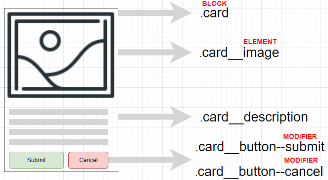
BEM (Block, Element, Modifier) is a component-based approach to web development. It is based on the principle of dividing the interface into independent blocks. It allows for easy and fast development of interfaces of any complexity and reusing existing code, avoiding “Copy-Paste”.
15. What is the difference between inline and block elements?
Elements in HTML are also divided into block and inline elements. Block elements are elements that serve as building blocks for web pages. They are used to separate the content of a web page into logical blocks, such as menus, headers, content blocks, footer, etc. Block elements are written on a new line; a line break is automatically added before and after these elements in the browser.
Block elements include
, , ,
, , ,
,
, , , , , , ,
-
, , , , , , , , , , , ,
, ,
, and . All block elements have opening and closing tags.
Inline elements mark parts of the content within elements. They only occupy a limited space defined by the tags, and the browser does not automatically add line breaks.
We use cookies on our website to give you the most relevant experience by remembering your preferences and repeat visits. By clicking “Accept All”, you consent to the use of ALL the cookies. However, you may visit "Cookie Settings" to provide a controlled consent.
This website uses cookies to improve your experience while you navigate through the website. Out of these, the cookies that are categorized as necessary are stored on your browser as they are essential for the working of basic functionalities of the website. We also use third-party cookies that help us analyze and understand how you use this website. These cookies will be stored in your browser only with your consent. You also have the option to opt-out of these cookies. But opting out of some of these cookies may affect your browsing experience.
Necessary cookies are absolutely essential for the website to function properly. These cookies ensure basic functionalities and security features of the website, anonymously.
Cookie
Duration
Description
cookielawinfo-checkbox-analytics
11 months
This cookie is set by GDPR Cookie Consent plugin. The cookie is used to store the user consent for the cookies in the category "Analytics".
cookielawinfo-checkbox-functional
11 months
The cookie is set by GDPR cookie consent to record the user consent for the cookies in the category "Functional".
cookielawinfo-checkbox-necessary
11 months
This cookie is set by GDPR Cookie Consent plugin. The cookies is used to store the user consent for the cookies in the category "Necessary".
cookielawinfo-checkbox-others
11 months
This cookie is set by GDPR Cookie Consent plugin. The cookie is used to store the user consent for the cookies in the category "Other.
cookielawinfo-checkbox-performance
11 months
This cookie is set by GDPR Cookie Consent plugin. The cookie is used to store the user consent for the cookies in the category "Performance".
viewed_cookie_policy
11 months
The cookie is set by the GDPR Cookie Consent plugin and is used to store whether or not user has consented to the use of cookies. It does not store any personal data.
Functional cookies help to perform certain functionalities like sharing the content of the website on social media platforms, collect feedbacks, and other third-party features.
Performance cookies are used to understand and analyze the key performance indexes of the website which helps in delivering a better user experience for the visitors.
Analytical cookies are used to understand how visitors interact with the website. These cookies help provide information on metrics the number of visitors, bounce rate, traffic source, etc.
Advertisement cookies are used to provide visitors with relevant ads and marketing campaigns. These cookies track visitors across websites and collect information to provide customized ads.


