

In this tutorial, we will create a responsive image gallery component using Tailwind CSS and Flowbite. Tailwind CSS is a popular open-source utility-first CSS framework for building custom designs, while Flowbite is a popular open-source component library built on top of Tailwind CSS.
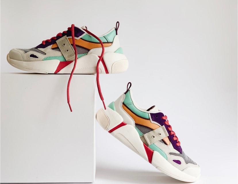
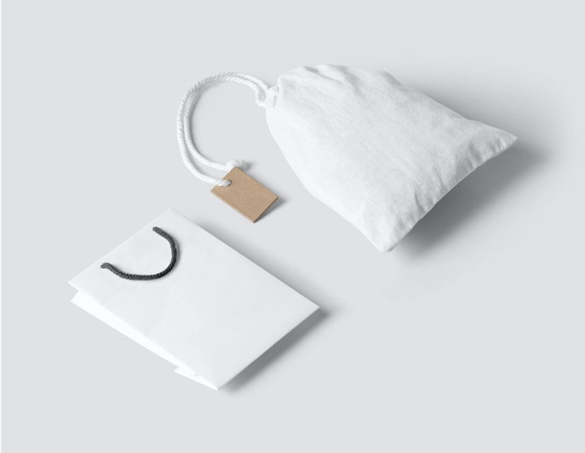
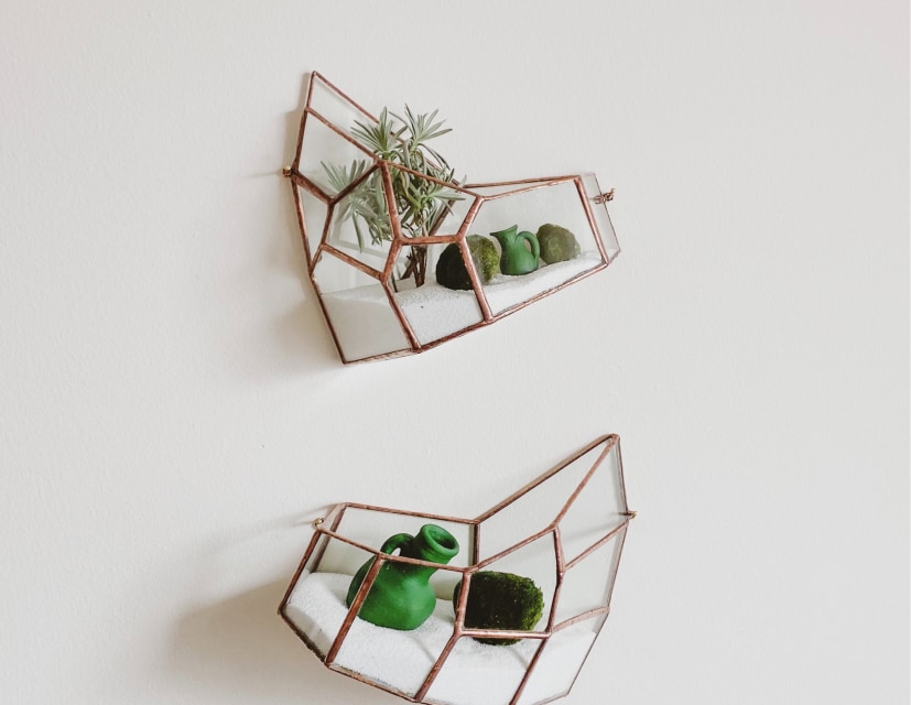
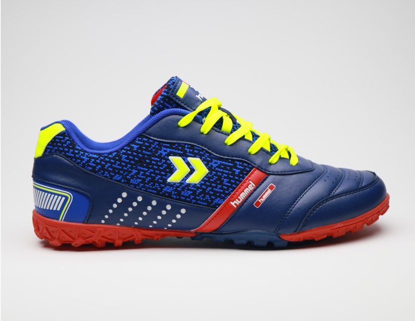
Here’s the example that we will build:

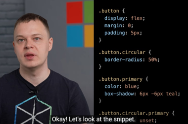
You can also check out this video for a presentation:
 Presentation of the new gallery component 🎥15:24 PM – 15 Mar 2023


Prerequisites
Make sure you have Tailwind CSS and Flowbite installed in your project. If you haven’t, follow the installation steps mentioned in the previous section.
Creating the Image Gallery Component
Now that we have our Tailwind CSS and Flowbite setup, we can start building the image gallery component.
HTML Structure
First, let’s create the basic HTML structure for the image gallery. We will have a parent div with the class grid and multiple child div elements, each containing an image.

Styling with Tailwind CSS and Flowbite
Now let’s style the image gallery component using Tailwind CSS classes.
Here’s a breakdown of the Tailwind CSS classes used:
-
grid: Enables the CSS grid layout. -
grid-cols-2: Sets the number of grid columns to 2. -
md:grid-cols-3: Sets the number of grid columns to 3 on – medium-sized screens and above. -
gap-4: Sets the gap between the grid items. -
h-auto: Sets the height of the image to auto. -
max-w-full: Sets the maximum width of the image to 100%. -
rounded-lg: Applies a large border-radius to the image.
Responsive Design
The image gallery component is already responsive, as it adapts to the screen size using the grid-cols-* classes. On small screens, it displays two columns, and on medium-sized screens and above, it displays three columns.
Final result
Here’s the code example with the full code:


Conclusion
Congratulations! You’ve successfully created a responsive image gallery component using Tailwind CSS and Flowbite. This component is flexible and easy to customize, making it a great addition to your web projects.
Here’s how your component should look like in the end:

You can check out more Tailwind CSS Gallery and Masonry Grid examples from the open-source UI component library called Flowbite.


