Tailwind CSS tutorial #13: Flex Direction

tailwind-css-tutorial-#13:-flex-direction

In the article, we will go into detail on how to use flex-direction.

Flex Direction

The flex-direction property is sub-property of flexible box layout module. It established the main axis of the flexible item. the main axis of the flex item is the primary axis. It’s not necessarily horizontal all the time it basically depends on the flex-direction property.
Format

flex-{direction}

Alignment Tailwind Class CSS Property
Row flex-row flex-direction: row;
Row reversed flex-row-reverse flex-direction: row-reverse;
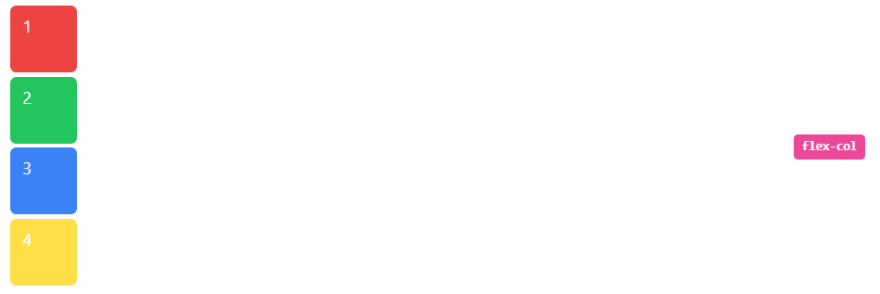
Column flex-col flex-direction: column;
Column reversed flex-col-reverse flex-direction: column-reverse;

let’s see each of this in action,

Row

It arranges the row the same as the text direction. The default value of flex-direction is a row. It is used to specify that the item has a normal text direction. It makes the item follow the normal text direction in lines.

 class="flex items-center justify-between px-4 py-2">
   class="flex w-full flex-row">
     class="mr-1 mb-1 inline h-16 w-16 rounded-md bg-red-500 px-3 py-2 text-white">1
     class="mr-1 mb-1 inline h-16 w-16 rounded-md bg-green-500 px-3 py-2 text-white">2
     class="mr-1 mb-1 inline h-16 w-16 rounded-md bg-blue-500 px-3 py-2 text-white">3
     class="mr-1 mb-1 inline h-16 w-16 rounded-md bg-yellow-300 px-3 py-2 text-white">4
  
class="ml-5 text-right"> class="rounded-2 mb-1 inline-block whitespace-nowrap rounded bg-pink-500 px-2 py-1 font-mono text-xs font-semibold text-white">flex-row

Output:
Image description

Row reversed

This class is used to follow the opposite text direction. It makes flex items in reverse order exactly the opposite of text direction as we can see in the Output.

 class="flex items-center justify-between px-4 py-2">
   class="flex w-full flex-row-reverse">
     class="mr-1 mb-1 inline h-16 w-16 rounded-md bg-red-500 px-3 py-2 text-white">1
     class="mr-1 mb-1 inline h-16 w-16 rounded-md bg-green-500 px-3 py-2 text-white">2
     class="mr-1 mb-1 inline h-16 w-16 rounded-md bg-blue-500 px-3 py-2 text-white">3
     class="mr-1 mb-1 inline h-16 w-16 rounded-md bg-yellow-300 px-3 py-2 text-white">4
  
class="ml-5 text-right"> class="rounded-2 mb-1 inline-block whitespace-nowrap rounded bg-pink-500 px-2 py-1 font-mono text-xs font-semibold text-white">flex-row-reverse

Output:
Image description

Column

It arranges the row as a column same as text direction but top to bottom. It is used to specify that the item has a normal top to bottom direction. It makes the item follow the normal top to bottom direction as we can see in the output.

 class="flex items-center justify-between px-4 py-2">
   class="flex w-full flex-col">
     class="mr-1 mb-1 inline h-16 w-16 rounded-md bg-red-500 px-3 py-2 text-white">1
     class="mr-1 mb-1 inline h-16 w-16 rounded-md bg-green-500 px-3 py-2 text-white">2
     class="mr-1 mb-1 inline h-16 w-16 rounded-md bg-blue-500 px-3 py-2 text-white">3
     class="mr-1 mb-1 inline h-16 w-16 rounded-md bg-yellow-300 px-3 py-2 text-white">4
  
class="ml-5 text-right"> class="rounded-2 mb-1 inline-block whitespace-nowrap rounded bg-pink-500 px-2 py-1 font-mono text-xs font-semibold text-white">flex-col

Output
Image description

Column reversed

It arranges the row as a column same as row-reverse bottom to top. It is used to specify that the item has a normal bottom to top direction. It makes the item follow the normal bottom to top direction as we can see in the output.

 class="flex items-center justify-between px-4 py-2">
     class="flex flex-col-reverse w-full">
       class="inline w-16 h-16 bg-red-500 text-white px-3 py-2 rounded-md mr-1 mb-1">1
       class="inline w-16 h-16 bg-green-500 text-white px-3 py-2 rounded-md mr-1 mb-1">2
       class="inline w-16 h-16 bg-blue-500 text-white px-3 py-2 rounded-md mr-1 mb-1">3
       class="inline w-16 h-16 bg-yellow-300 text-white px-3 py-2 rounded-md mr-1 mb-1">4
    
class="ml-5 text-right"> class="text-xs font-semibold inline-block font-mono whitespace-nowrap px-2 py-1 rounded text-white bg-pink-500 rounded-2 mb-1">flex-col-reverse

Output:
Image description

Full code:
The overall code will be attached to repo link.

Overall Output
Image description

Resources:
tailwind.css

Thank you for reading :), To learn more, check out my blogs on Justify-Content, Responsive Navbar and Justify-Item.
If you liked this article, consider following me on Dev.to for my latest publications. You can reach me on Twitter.

Keep learning! Keep coding!! 💛

Total
3
Shares
Leave a Reply

Your email address will not be published. Required fields are marked *

Previous Post
top-10-services-apache-apisix-use-cases

Top 10 services Apache APISIX use-cases

Next Post
full-stack-web3-project

Full Stack Web3 Project

Related Posts