When we use UI libraries like Material UI in our React project, sometimes we need to customize color in both dark and light modes instead of using its default colors. This post will instruct you how to do that.
- First, make sure you have installed Material UI if you have not installed it yet, let’s type:
npm install @mui/material @emotion/react @emotion/styled
- Next, we will create a file named
custom-themes.ts:
// custom-themes.ts
import { experimental_extendTheme as extendTheme } from "@mui/material/styles";

//If you are using TypeScript, you must declare your custom color's name in both PaletteOptions and Palette in module "@mui/material/styles"
declare module "@mui/material/styles" {
  interface PaletteOptions {
    "bg-text-input": string;
  }
  interface Palette {
    "bg-text-input": string;
  }
}

const customTheme = extendTheme({
  cssVarPrefix: "",
  colorSchemes: {
    light: {
      palette: {
        "bg-text-input": "#C0C0C0", // Specify color in light mode for "bg-text-input"
      },
    },
    dark: {
      palette: {
        "bg-text-input": "#0f1a2a", // Specify color in dark mode for "bg-text-input"
      },
    },
  },
});

export default customTheme;
- In
App.tsxfile, we wrapthemeproperty in this component, it will receivecustomTheme, which we have declared above as a value. And don’t forget to add
// App.tsx
import { Box, CssBaseline } from "@mui/material";
import { Experimental_CssVarsProvider as CssVarsProvider } from "@mui/material/styles";

import Home from "./pages/Home";
import customTheme from "./themes/custom-themes";

const App = () => {
  return (
    <CssVarsProvider theme={customTheme}>
      <CssBaseline />
      <Box
        sx={{
          minHeight: "100vh",
          width: "100%",
          maxWidth: "1200px",
          margin: "auto",
          paddingTop: 10,
          paddingLeft: 30,
          paddingRight: 30,
          paddingBottom: 30,
        }}
      >
        <Home />
      Box>
    CssVarsProvider>
  );
};

export default App;
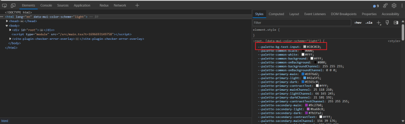
- We also create a file named
_variables.scss. This file will redeclare all our custom colors that we have declared incustom-themes.tsfile. The purpose of doing this is so that we can use our custom colors in scss. It’s convenient for customizing nested element in Material UI, which we can not style it directly. I will show you clearly below.
// _variables.scss
$bg-text-input: var(--palette-bg-text-input);
--palette-bg-text-inputwas created by Material UI in:root
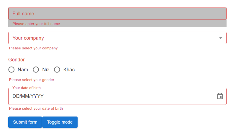
- And now, example we want to customize background color in TextField component.
import React from "react";
import { TextField, TextFieldProps } from "@mui/material";

type TInputProps = TextFieldProps & {};

const Input = React.forwardRef<HTMLInputElement, TInputProps>(
  ({ ...otherProps }, ref) => {
    return (
      <TextField
        size="small"
        fullWidth
        ref={ref}
        {...otherProps}
        sx={{backgroundColor: (theme) => theme.palette["bg-text-input"]}}
      />
    );
  }
);

export default Input;
- Oops, the background color spills over to the our helper text
- That why we need to create a
.scssfile to style nested element. First, we need to press F12 to see exact element that we want to style it.
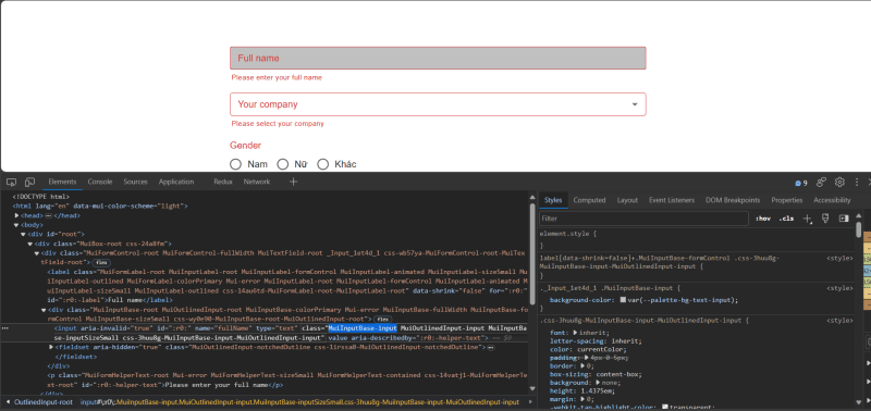
The element we want to style its background color is the element which has class=”MuiInputBase-input”. So in Input.module.scss file, it will look like this:
@import "src/themes/variables";

.Input {
  & :global(.MuiFormHelperText-root) {
    margin-left: 3px;
  }
  & :global(.MuiInputBase-input) {
    background-color: $bg-text-input;
  }
}
and now in our custom TextField component:
import React from "react";
import { TextField, TextFieldProps } from "@mui/material";

import styles from "./Input.module.scss";

type TInputProps = TextFieldProps & {};

const Input = React.forwardRef<HTMLInputElement, TInputProps>(
  ({ ...otherProps }, ref) => {
    return (
      <TextField
        size="small"
        fullWidth
        ref={ref}
        {...otherProps}
        className={styles.Input} // Specify the wrapper class for this component
      />
    );
  }
);

export default Input;
-
Now it looks better.
-
Finally, we will create a button to switch between light and dark mode. We use a hook provided by Material UI called
useColorScheme:
import { Button, useColorScheme } from "@mui/material";

const ToggleModeButton = () => {
  const { mode, setMode } = useColorScheme();
  return (
    <Button
        variant="contained"
        sx={{ mt: 2, textTransform: "none" }}
        onClick={() => {
          setMode(mode === "light" ? "dark" : "light");
        }}
      >
        Toggle mode
      Button>
  )
}
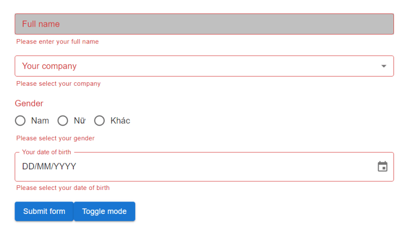
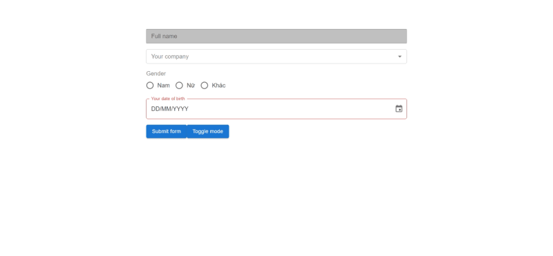
- And now we will see the result:
Light mode

Dark mode
- Thanks for reading here. Hope this post will help you <3.


